Cost analysis
- 24 Jun 2026
- 9 Minutes to read
- Print
- DarkLight
- Download PDF
Cost analysis
- Updated on 24 Jun 2026
- 9 Minutes to read
- Print
- DarkLight
- Download PDF
Article summary
Did you find this summary helpful?
Thank you for your feedback!
Introduction
The Analysis section, available within the Cost Analyzer module, provides users with powerful tools to explore and visualize Azure spending. It allows detailed analysis through flexible filters, groupings, and charts, helping users track usage patterns and identify cost-saving opportunities.
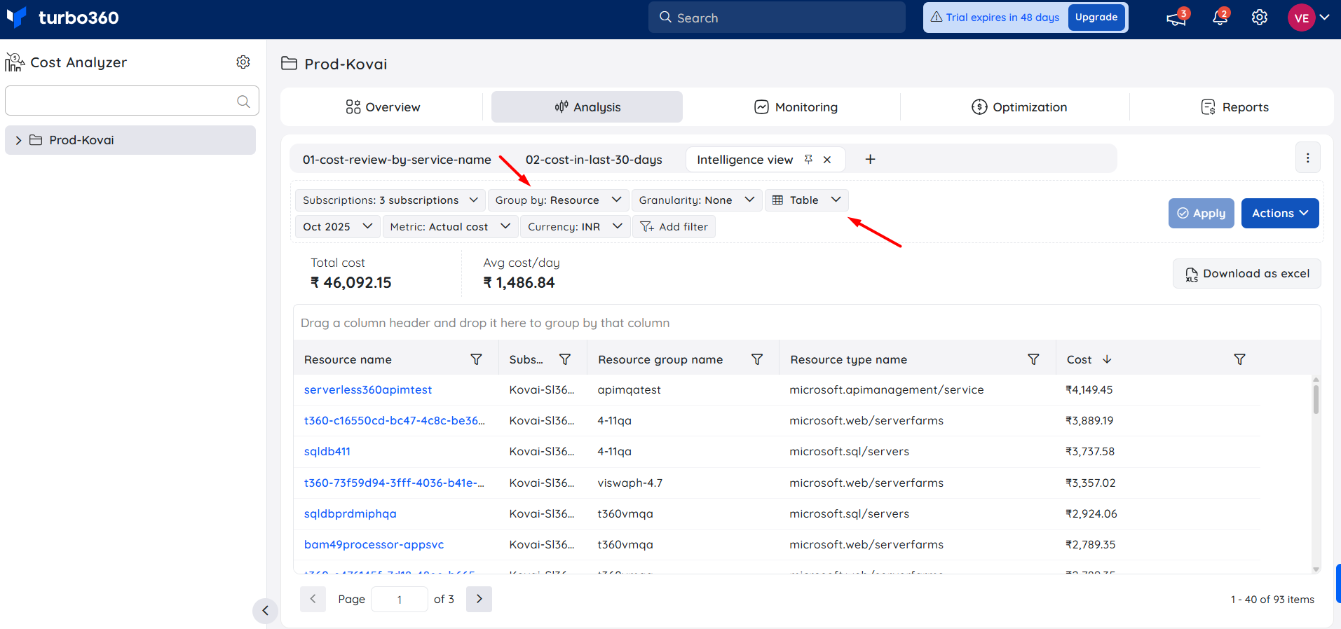
Cost intelligence view
The Cost intelligence view structures resource data into distinct categories and visual sections, providing users with a detailed overview of cost distribution and utilization. It highlights key optimization opportunities by identifying areas of high or low resource efficiency.
Through these categorized insights, users can easily monitor spending patterns, evaluate cost performance, and take data-driven actions to optimize resource usage and reduce overall expenses.
How to access this view?
The cost intelligence view becomes available only when:
- The Group by filter is set to Resource
- The Chart format is set to Table in the Analysis view
- Clicking a resource from the grid displays the Cost intelligence view for the relevant resource.
Key capabilities
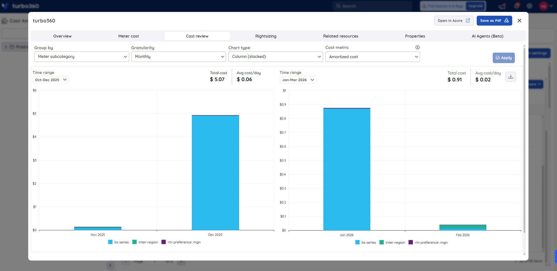
1. Cost review
- The Cost review section offers interactive charting tools for examining cost trends across various time frames. Users can analyze spending behavior, detect inefficiencies, and leverage insights to optimize resource utilization and manage cloud expenditure effectively.
2. Rightsizing
The Rightsizing section offers visual insights into resource utilization and highlights the current and recommended SKU, with the option to apply the recommended SKU instantly.
.png)
3. Reservation
The Reservation section visualizes resource usage and shows the current and recommended SKU, including available one-year and three-year reservation commitments.
.png)
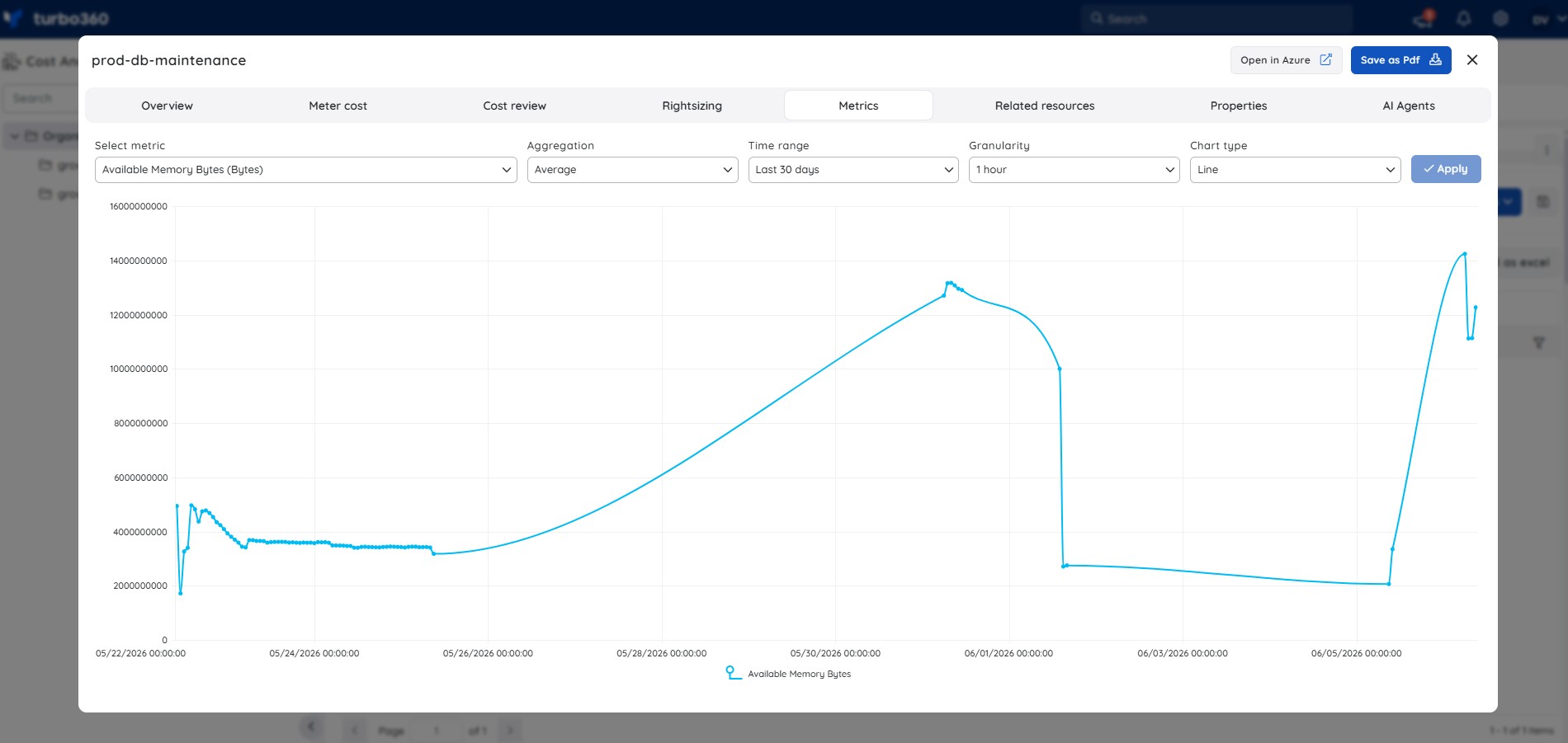
4. Metrics
The Metrics tab in the single resource view allows users to visualize Azure monitor metrics for a resource — such as CPU usage or memory availability — directly within Turbo360.
.jpg)
To visualize resource metrics:
1. Open a resource from the Analysis grid to access the single resource view.
2. Select the Metrics tab.
3. Configure the Select metric, Aggregation, Time range, Granularity, and Chart type filters.
4. Click Apply to render the chart.
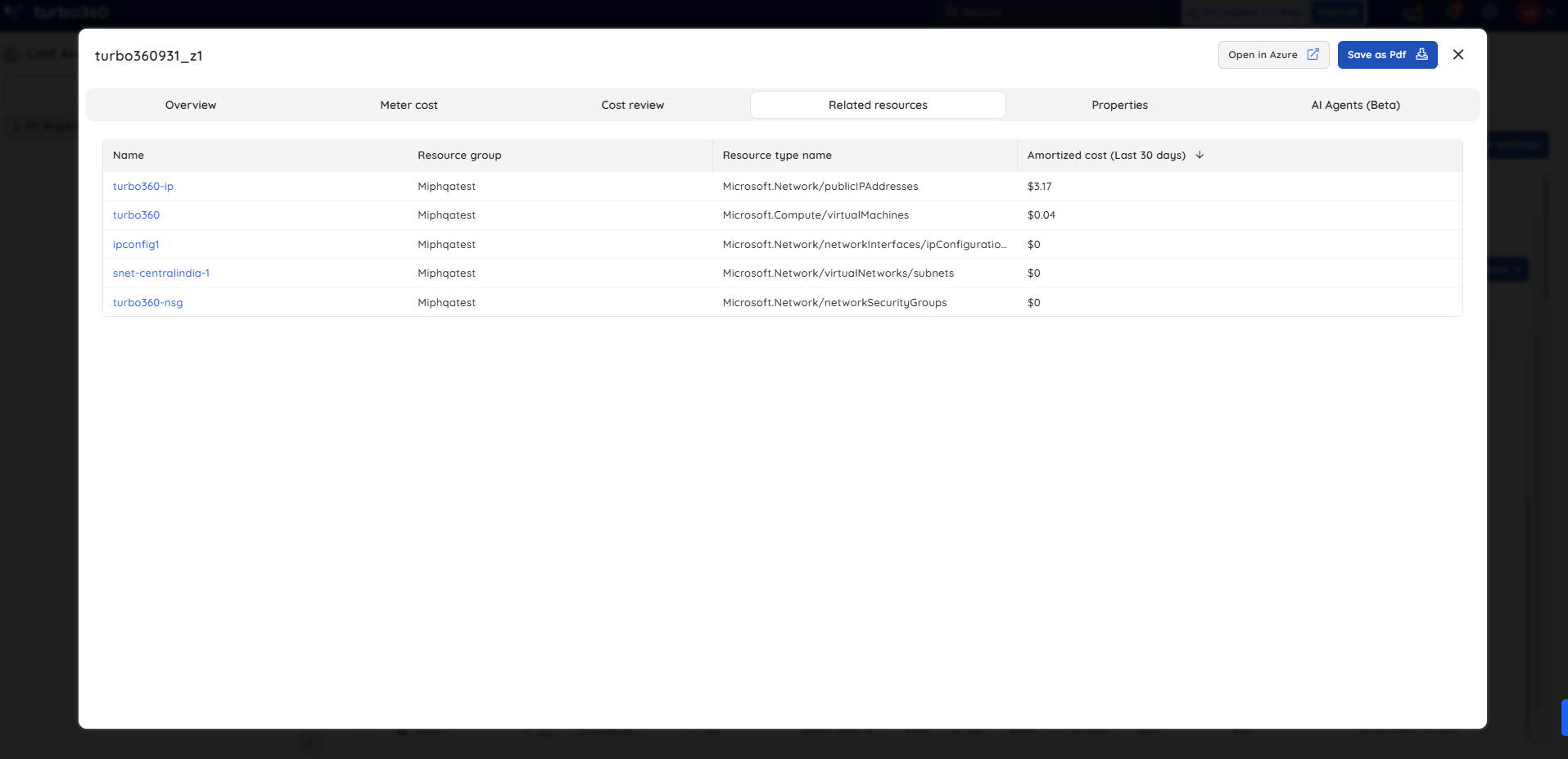
5. Related resources
The Related resources section lists all resources linked to a given Azure resource, along with their amortized costs for the past 30 days, providing insights into spending and resource relationships.
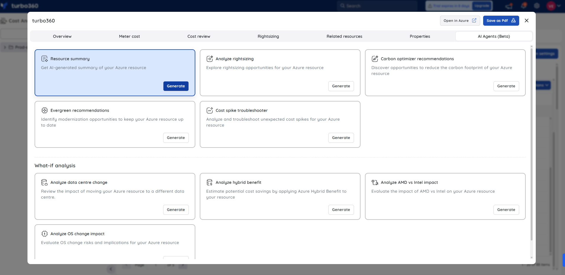
6. AI Agents
The AI Agents section supports multiple AI agents to automatically assess resources, uncover usage patterns, and deliver recommendations for optimized performance, cost efficiency, and resource utilization.
With these AI Agents, users can:
- View AI-generated resource summaries to gain an overview of resource utilization and configuration.
- Explore rightsizing opportunities to optimize Azure resources for performance and cost efficiency.
- Discover opportunities to reduce the carbon footprint of Azure resources and support sustainability goals.
- Identify modernization opportunities to ensure Azure resources remain up to date with best practices.
- Analyze and troubleshoot unexpected cost spikes to understand and address anomalous spending.
- Review the impact of moving a resource to a different data center for performance, latency, or cost considerations.
- Estimate potential cost savings by applying Azure Hybrid benefit to eligible resources.
- Evaluate the impact of processor choices (AMD vs Intel) on resource performance and cost.
- Assess OS change risks and implications for Azure resources before implementing updates.
Built-in filters
The following section describes the essential filters that must be set to display cost expenditure data tailored to user-defined criteria, ensuring the output aligns with the desired scope, level of detail, and analytical perspective for accurate cost evaluation.
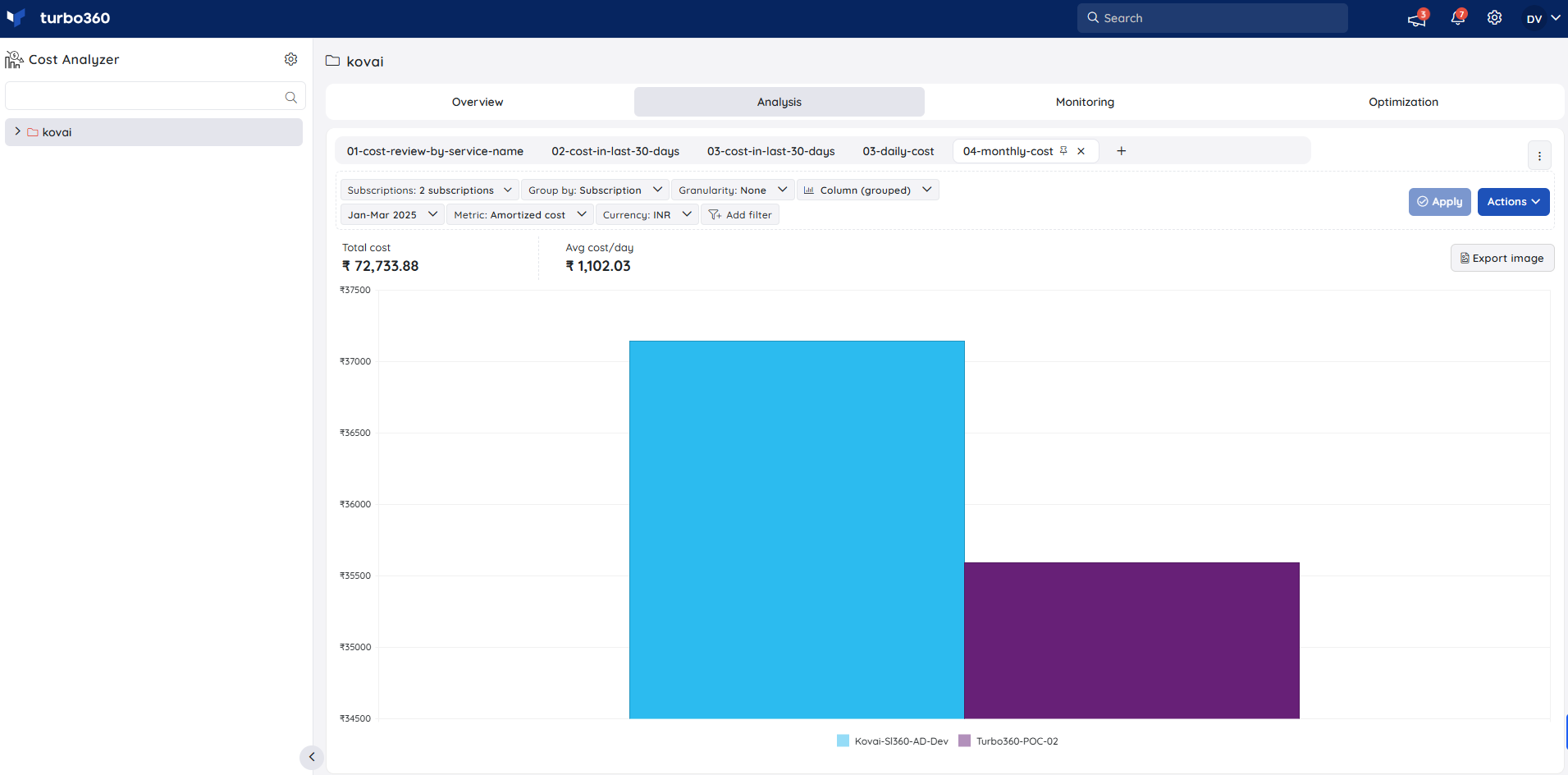
1. Subscriptions
The Subscriptions filter is used to select the required subscriptions from the available subscriptions in an analysis view before proceeding with other filtering options.
The Subscriptions filter displays a list of subscriptions that can be accessed from the associated Service principals.
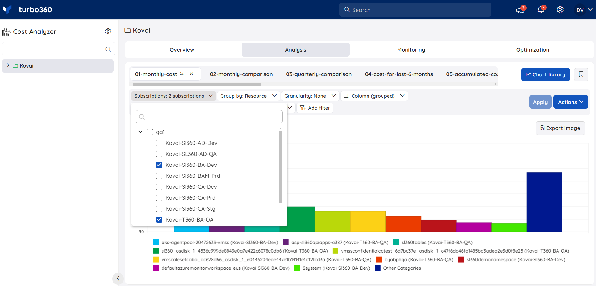
The analysis view shows both the total cost and the daily average cost for the selected subscriptions.
2. Time interval
Users can select the required time interval to display the cost data for the specified time period. Users can also provide a custom date range.
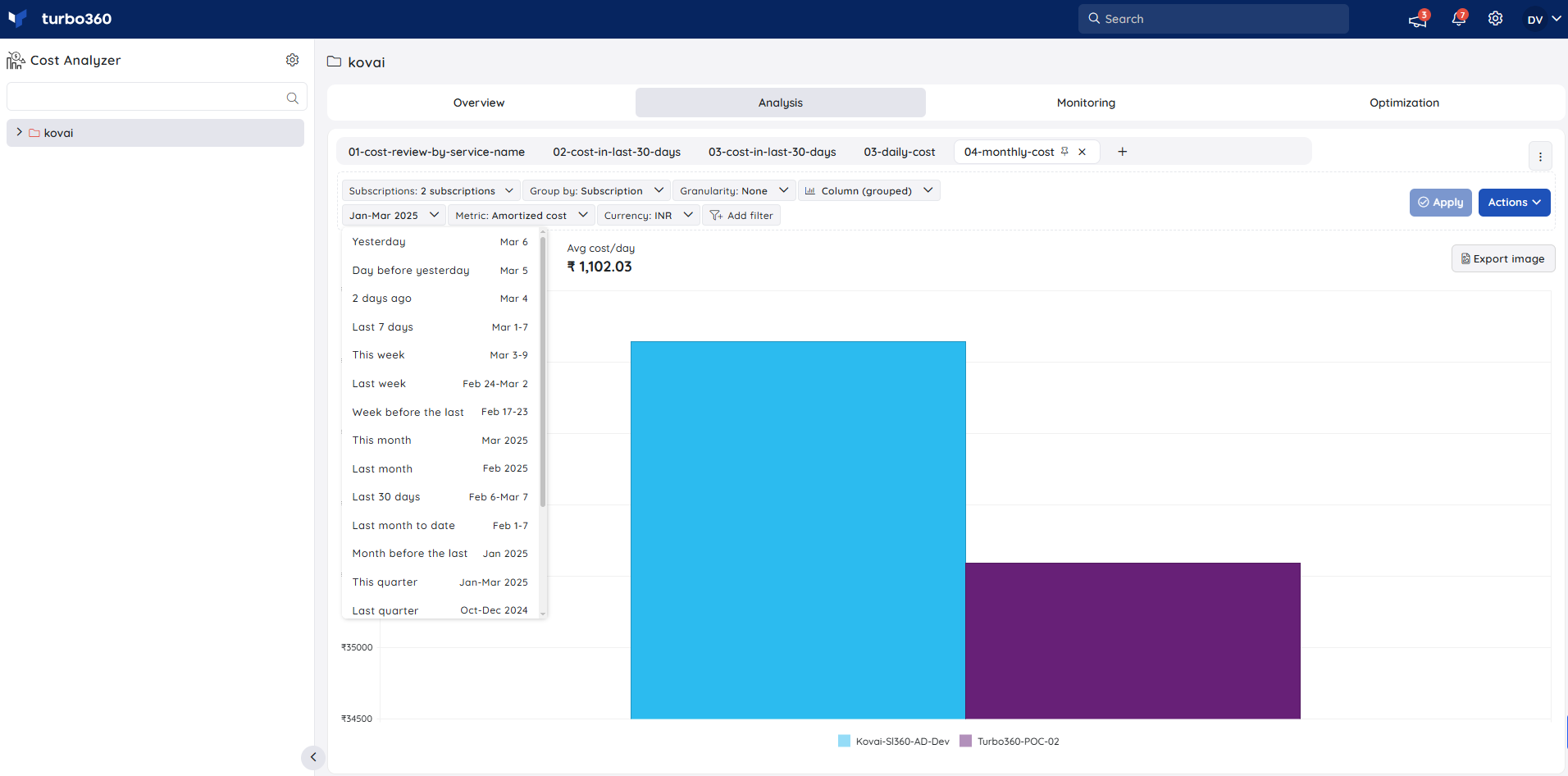
The custom date range is restricted to a limit of 1 year from the current date.
Views within Cost Analyzer are used to visualise the cost of Azure subscriptions as charts and tables. Each view can be defined based on customizable filtering options like subscriptions, resource groups, tags, etc.
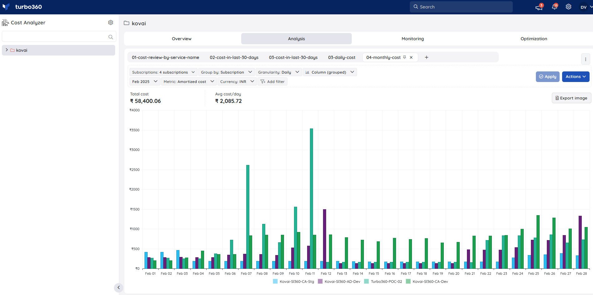
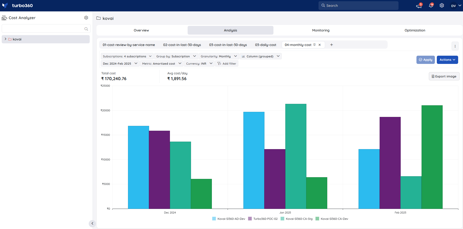
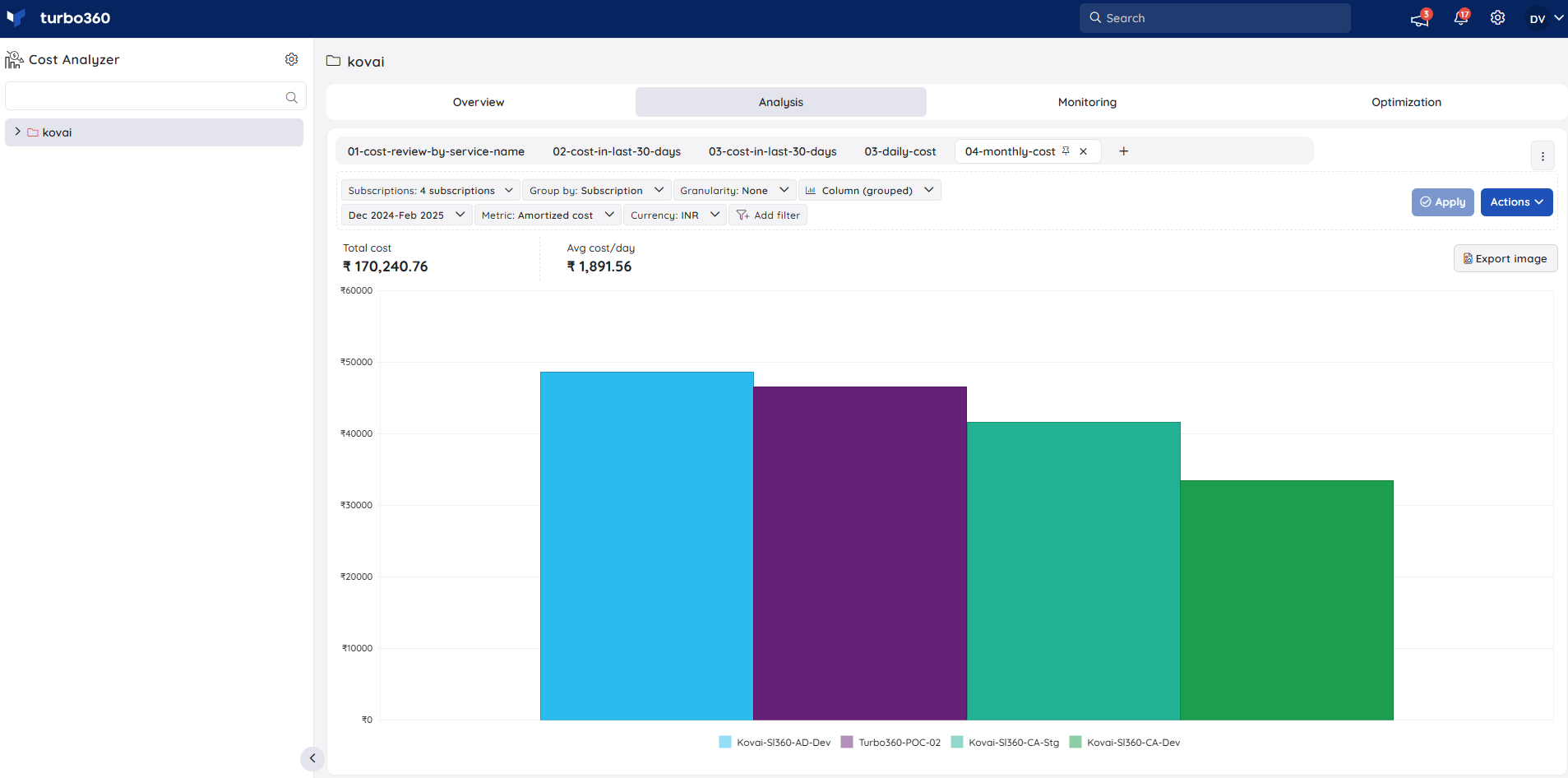
3. Granularity
Accumulated
Choosing the Accumulated option and required time interval accumulates the data from the beginning to the end of the time interval to display the total cost for the selected filter categories.

Daily
Select the Daily option and the required time interval to view the cost spent on the selected filter categories for each day within the provided time interval.
Monthly
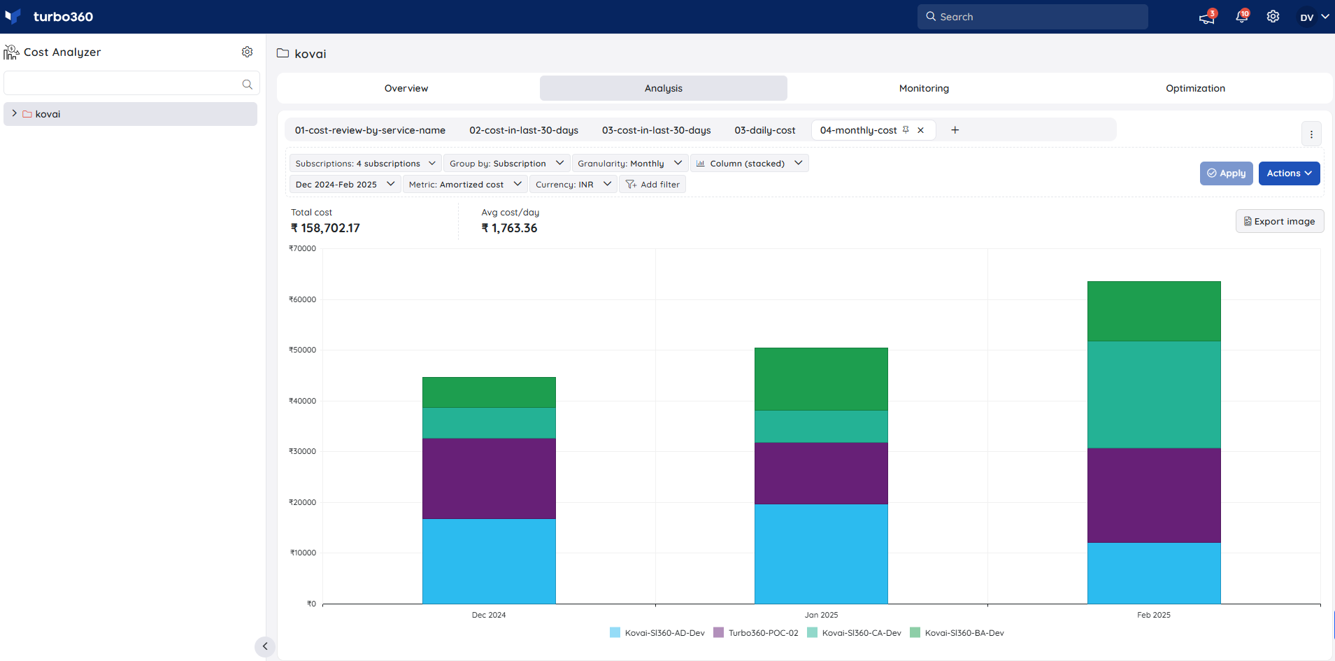
Choosing the Monthly option and required time interval displays the cost spent on the selected filter categories every month.
None
Choosing the None option and required time interval displays the total cost spent based on the selected filter categories.
4. Currency
The Currency filter allows users to choose a specific currency type for the selected subscriptions to view their cost details.
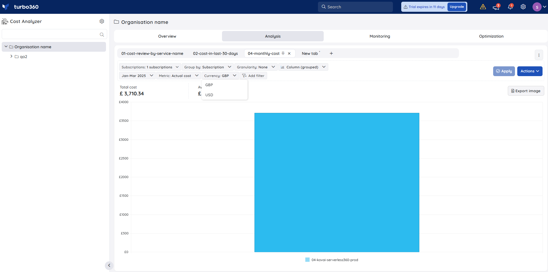
If there are n number of subscriptions with different currency types, then the Currency type will hold only USD. When the n number of subscriptions holds the same currency type, it will have USD and the subscription's primary currency type in the dropdown of the currency filter.
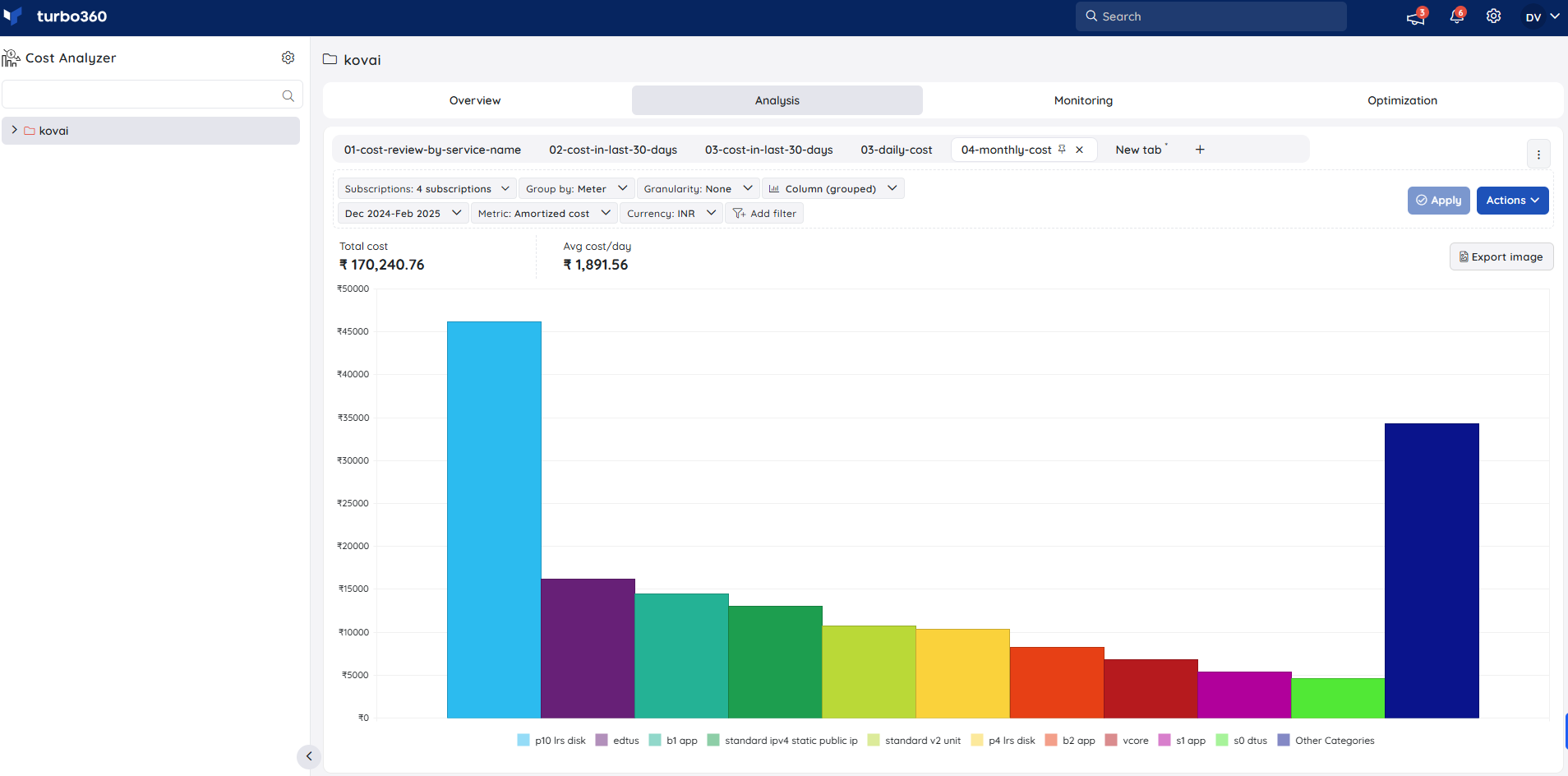
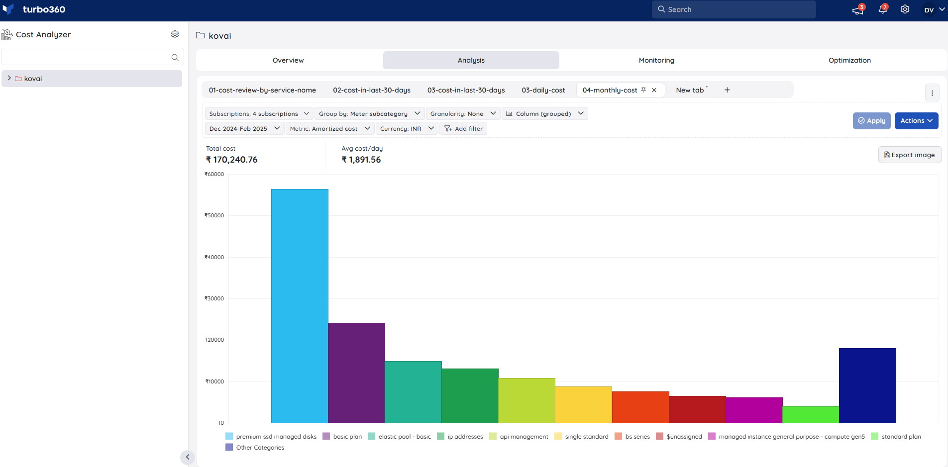
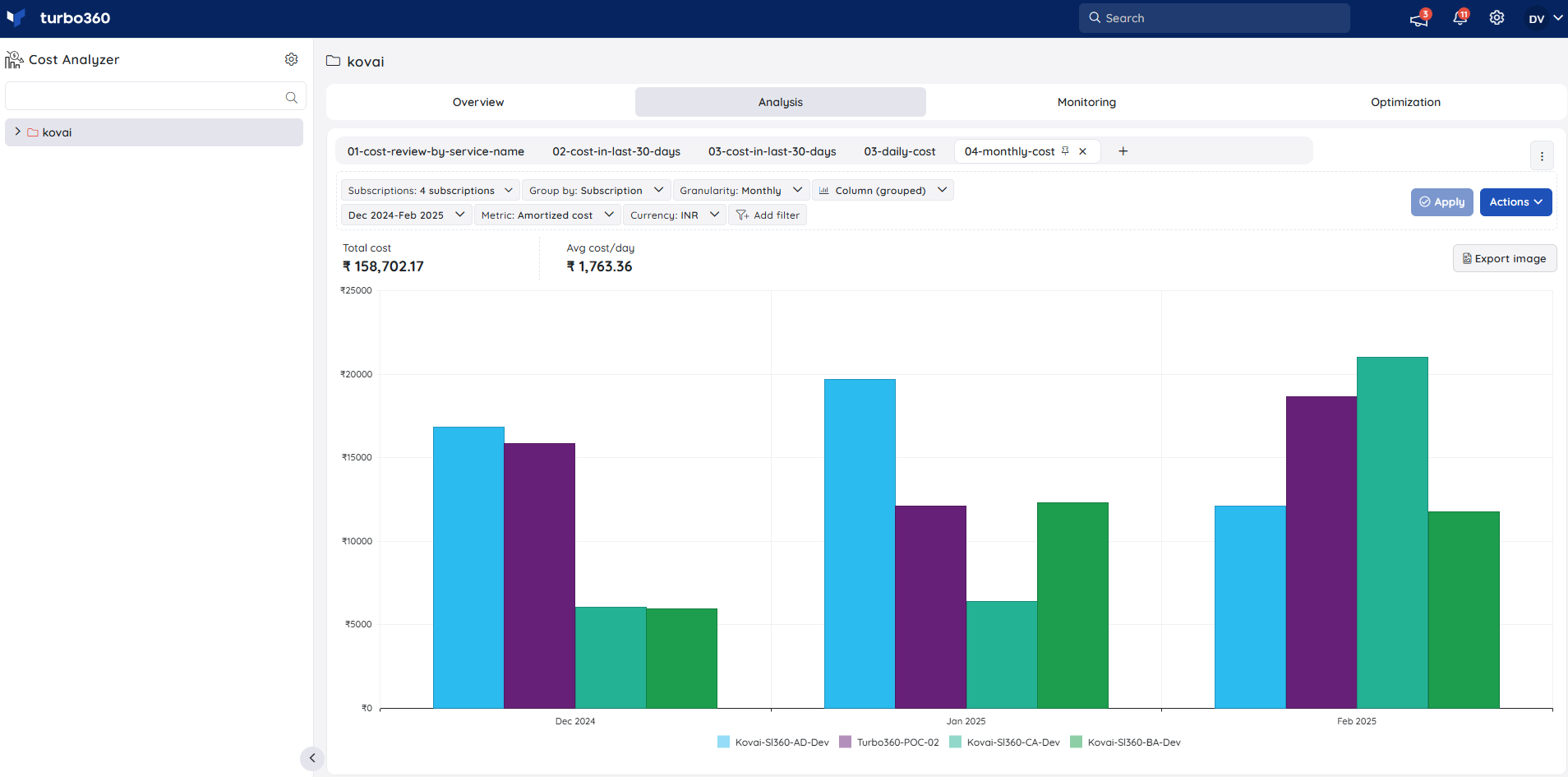
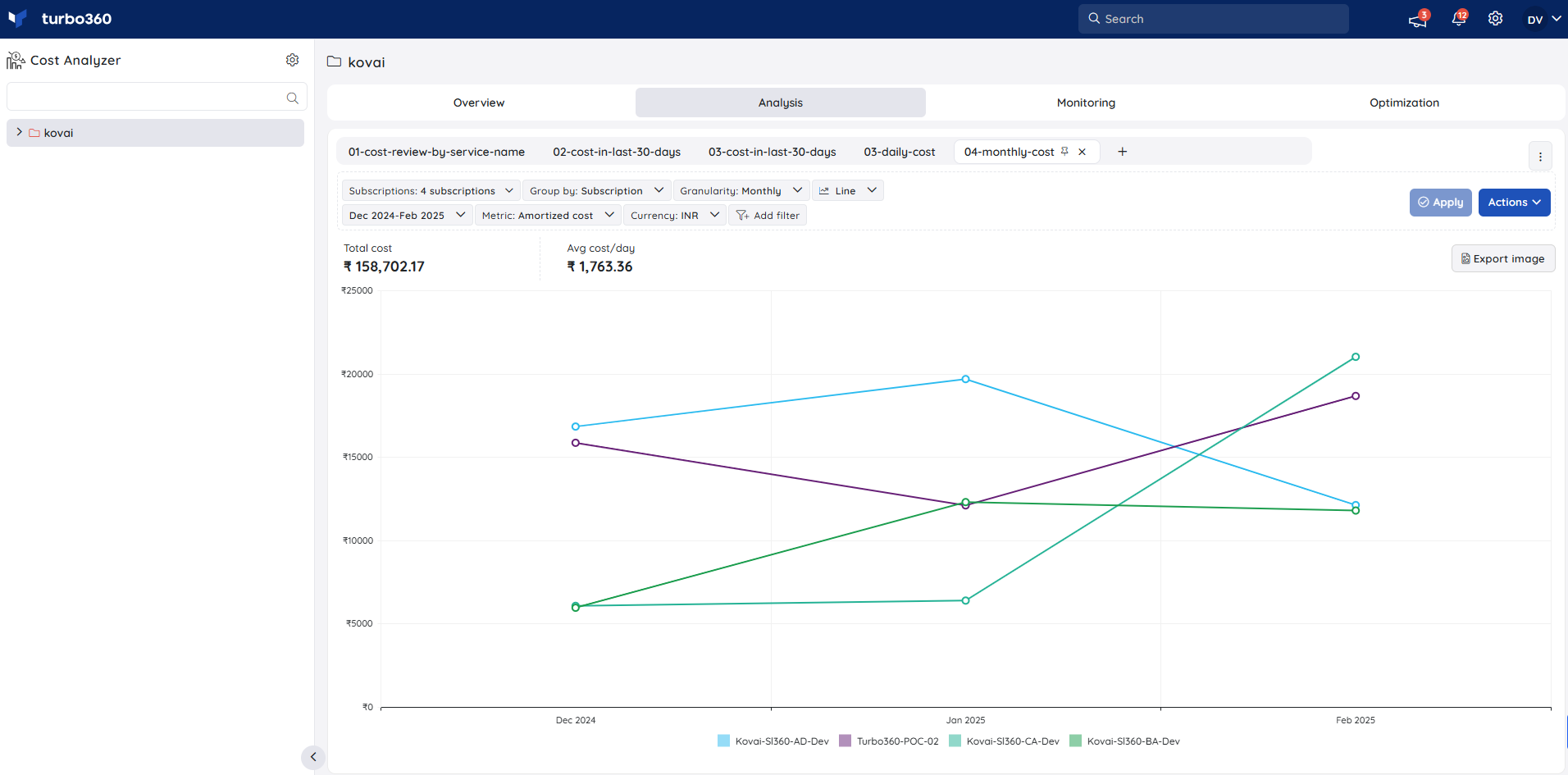
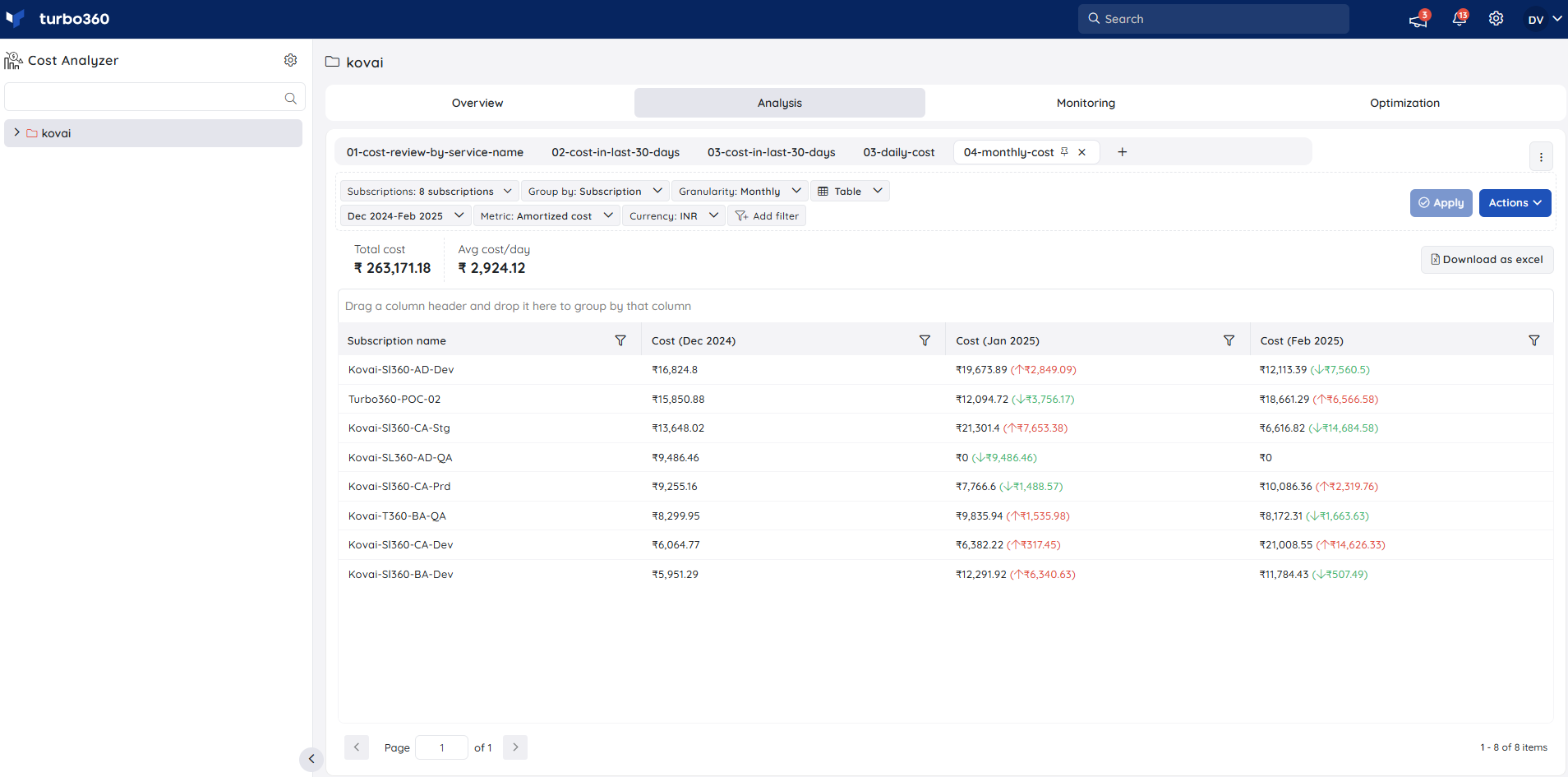
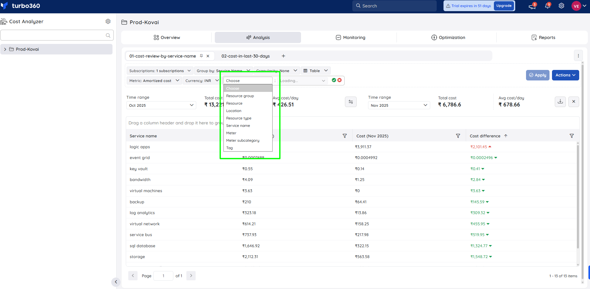
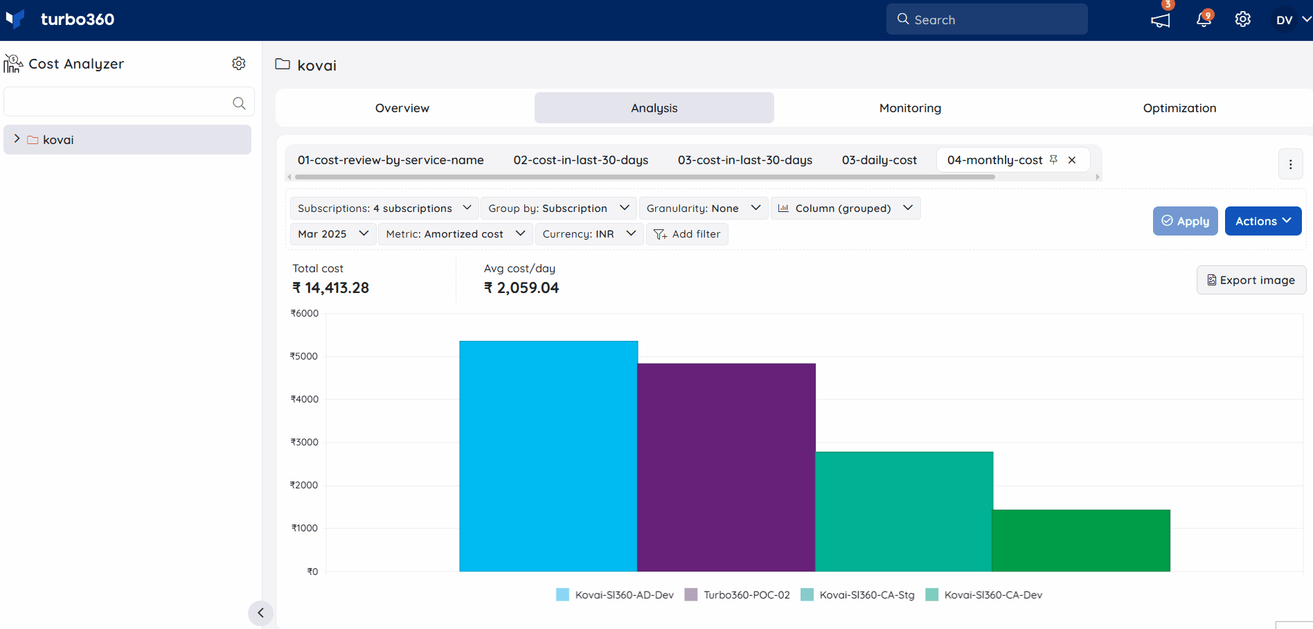
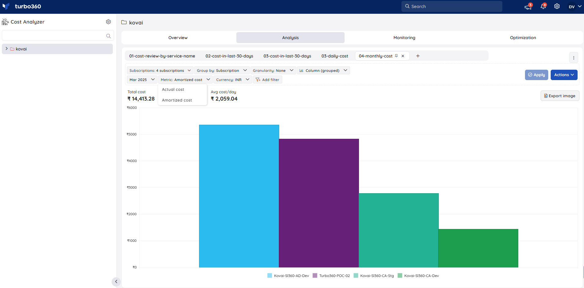
5. Group by
The chart data in an analysis view can be grouped using any one of the available options:
- Location
- Resource
- Resource Group
- Resource Type
- Subscription
- Tag
- Service Name
- Meter
- Meter subcategory
Location
The Location groups the cost data from the selected subscriptions based on the regions available.
This option is useful when the user is required to view the total cost used by the subscriptions in any specific location, for a specific period.

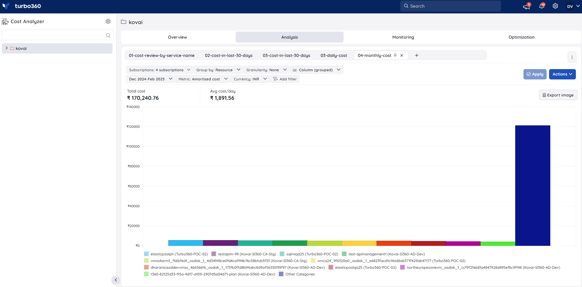
Resource
The Resource option groups the cost data from the selected subscriptions based on individual resources. This option can be used to identify the cost of individual resources in a subscription for a specified time period.
Resource Group
The Resource Group option groups the cost data from the selected subscriptions based on the resource groups.
Users can also view the cost usage of the resource groups that are no longer available in the selected subscriptions.

Resource Type
The Resource Type option groups the cost data from the selected subscriptions based on the resource types of resources.

Subscription
The Subscription option groups the total cost data from the selected subscriptions on a per-subscription basis.

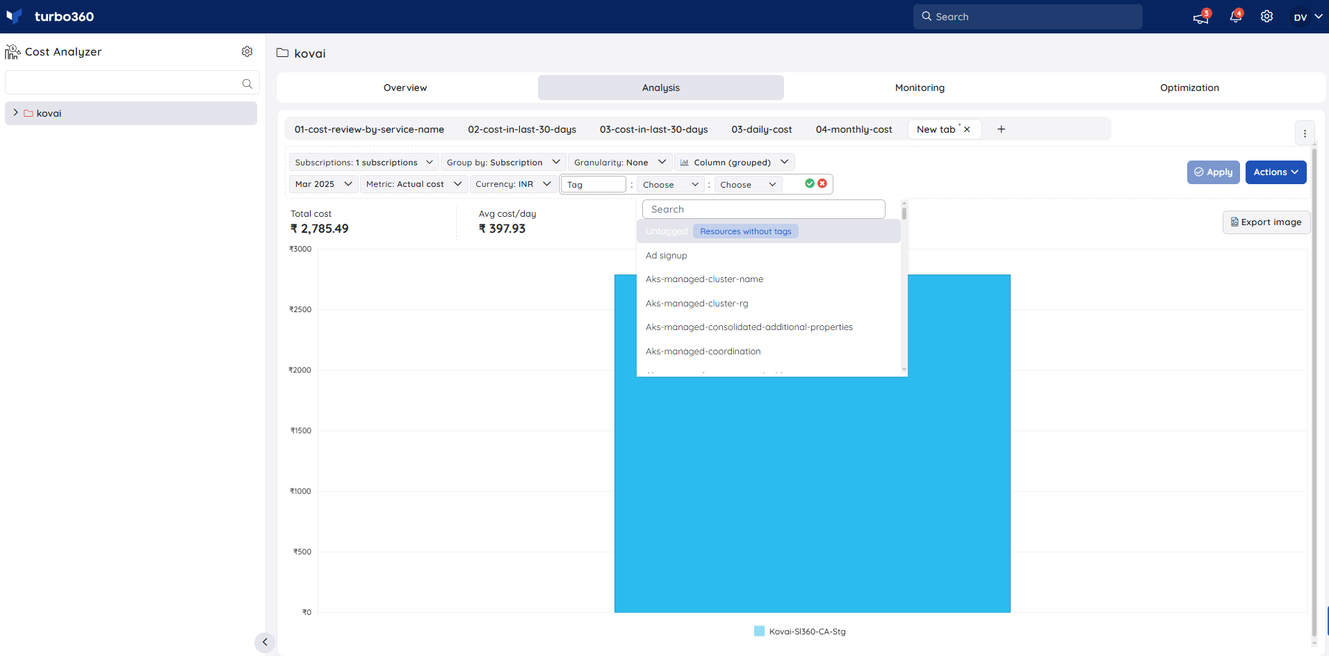
Tag
The Tag option allows users to group the cost data from the selected subscriptions based on Azure tags.
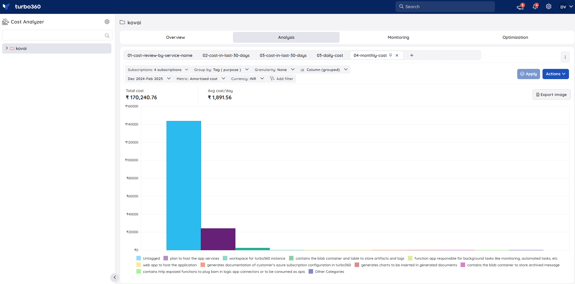
Selecting the Untagged option in the Tag filter will display the cost of Azure resources without any tags.
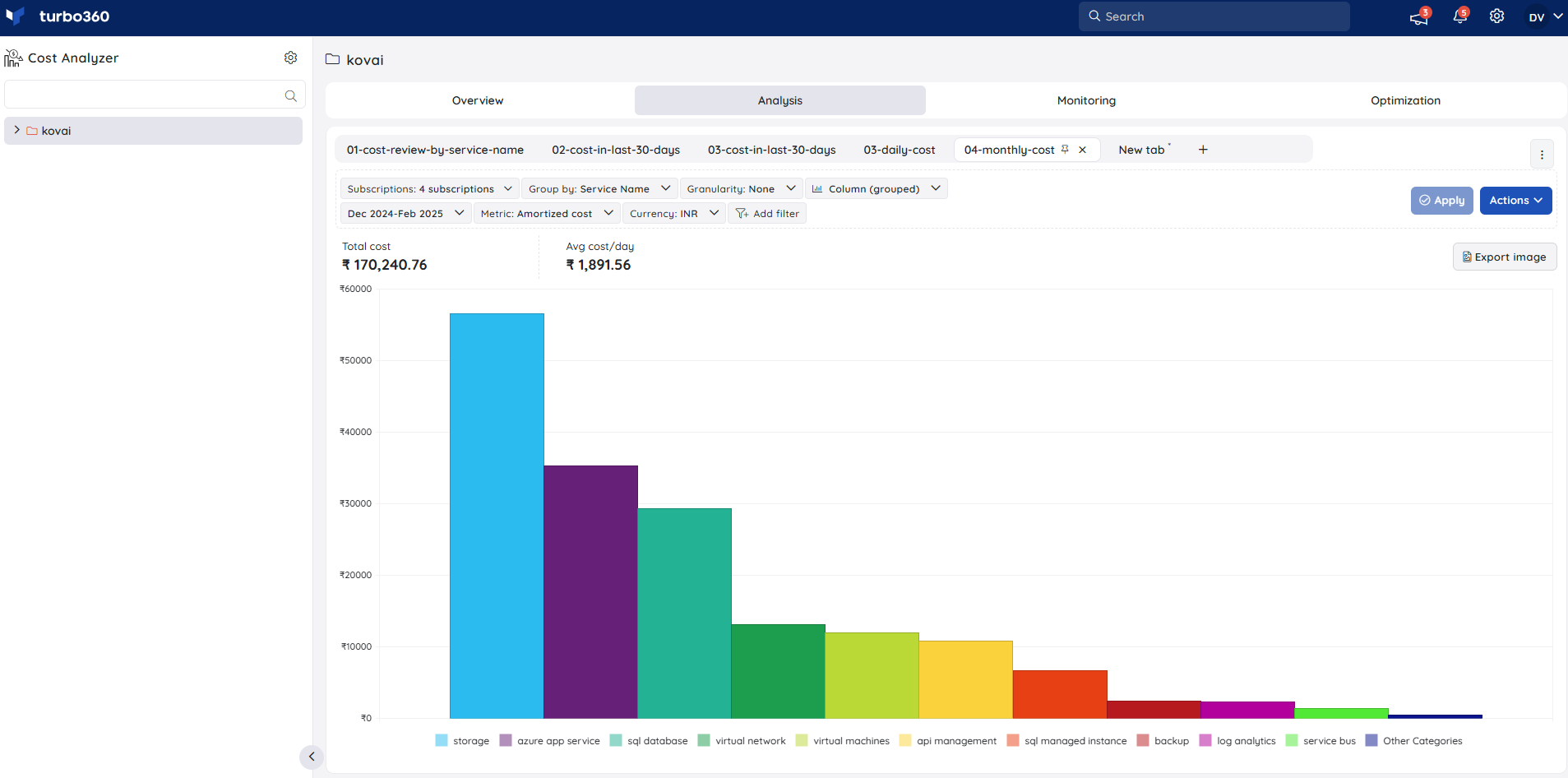
Service Name
The Service Name option allows users to group the cost data from the selected subscriptions based on Azure services.
Meter
The Meter option allows users to group the cost data from the selected subscriptions based on meters.
Meter subcategory
The Meter subcategory option allows users to group the cost data from the selected subscriptions based on meter subcategories.
Supported chart types
- Area
- Column (stacked)
- Column (grouped)
- Line
- Table
Area
An Area chart displays the cost comparison of various categories over a specified time, emphazised with different colors.
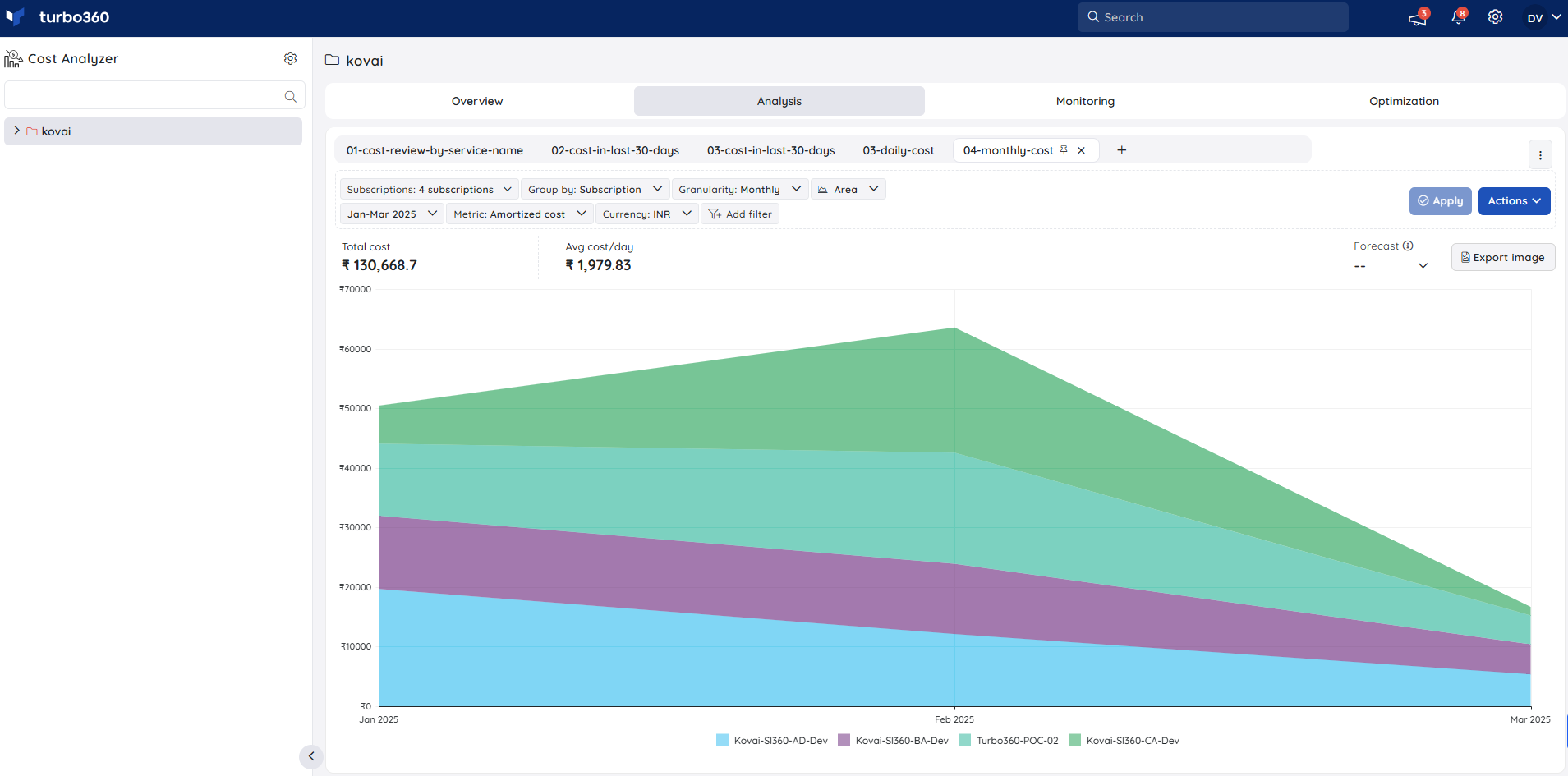
The Area chart will not be available when the Granularity value is set to None.
Column (stacked)
Categories are stacked one above the other in vertical columns. Stacked column charts are used to compare the total and parts of the filtered category data series efficiently.
Column (grouped)
Bar charts with categories displayed in the form of columns, each distinguished by a different color, are known as grouped column charts.
Line
A line chart is a graphical representation of the cost based on the categories that connects a series of data points with a continuous line.
Table
Cost details will be displayed as rows and columns where it is easy for the users to get a scrutinized view.
Filtering cost data
The Analysis view in Cost Analyzer allows users to examine and interpret cost data from various perspectives. To ensure that the most relevant information is easily accessible, the tool offers a range of flexible filtering options. These filters enable users to refine large datasets, focus on specific cost categories, and extract deeper, more actionable insights from their analysis.
Multi-layered filtering enables users to apply several filters together, providing the ability to perform a deeper, more targeted cost analysis.
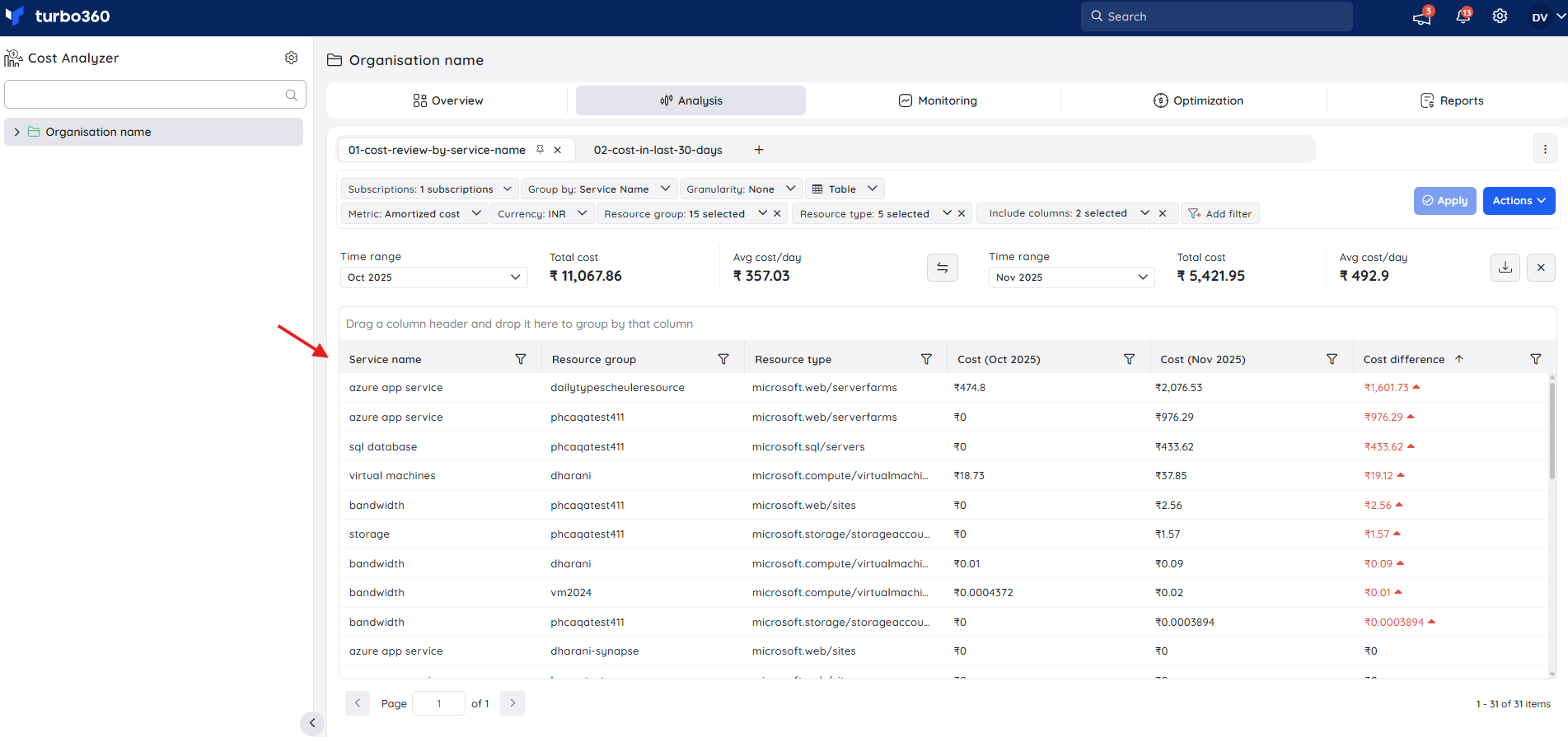
The image below highlights the filtering options that allow users to narrow down cost data as per their requirements.
Include columns
The Include columns option in Analysis allows users to enhance the analysis of cost data when the view is displayed in a table format. It enables adding the applied filter types as additional columns in the table to provide a more detailed and comprehensive cost view.
This option allows users to view cost data in a more detailed and segmented format, enabling clearer visibility of cost distribution across multiple dimensions in a single table view.
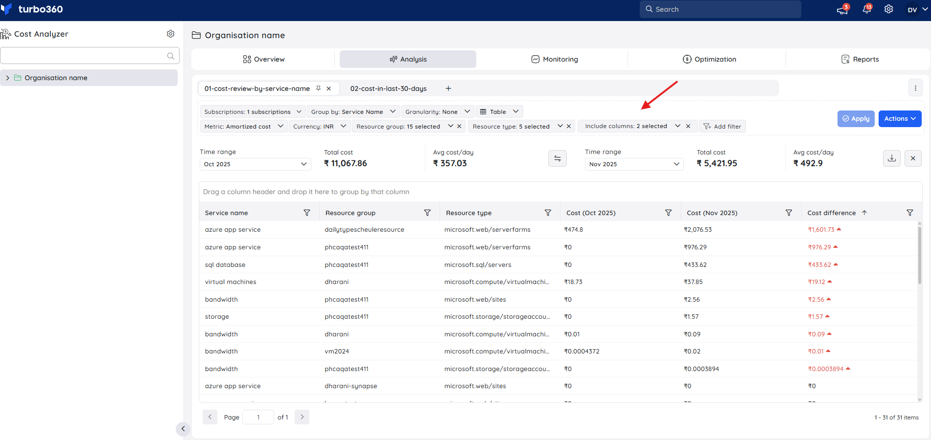
Configuring table view using the Include column filter option:
In the analysis view, set the chart type to Table.
Group the view by a selected filter type.
Add one or more filter types to the same view.
Open the Included columns dropdown from the configuration section.
Select a filter type from the dropdown to include it as an additional column in the table.
After selection, the table automatically updates to display:
The grouped-by column, and
The selected filter column from the Included Columns option.
Resetting cached data
Why reset cache?
In Cost Analyzer, cached data is utilized to enhance performance and reduce load times. However, this stored data may not always reflect the most recent updates to cost information.
To ensure that all saved views in Analysis within a cost management group display the latest and most accurate data, users may need to reset the cache periodically. Resetting the cache forces the system to refresh its data, ensuring alignment with the most current cost records.
Cost Analyzer executes a daily cache reset when the date rolls over.
Resetting cached data
Navigate to the following path within a saved view in the Analysis section: Actions -> Reset cached data
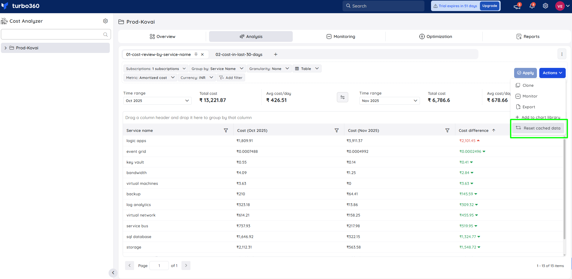
When to reset cache?
Users are advised to reset the cache under the following conditions:
- When the displayed cost data appears outdated or inconsistent with recent updates.
- After major modifications to the underlying cost group, such as updated scope.
- When encountering performance issues, delays, or data errors that may be related to cached content.
Forecasting
Forecasting within Cost Analyzer is a predictive analysis that estimates potential future expenditures done upon the resources and its services, helping users anticipate and manage their budget effectively.
How to access?
Forecasting is supported only for time ranges that include the current date or future dates.
- In the analysis view, select This Week, This Month, This Quarter, or This Year.
- Set Granularity to any value other than None.
- Choose a chart type other than Table.
- Click Apply.
.gif)
Notes:
The cost forecast is determined based on the resource and service usage within a subscription.
Any purchases made will not be factored into the prediction. Also, any changes in the usage may take about a week to be reflected in the Views.
Expand cost
Azure cost for a specific filter category can be easily viewed by clicking the chart data points in the Analysis section. The filtered data can be expanded further by clicking the data points in the new chart.
Cost metrics
Users can choose between Actual cost and Amortized cost for Azure subscription and resource cost visualization by using the Metric filter.
Actual cost - displays the raw usage and purchases for Azure and third-party Marketplace offerings as they will appear on the invoice.
Amortized cost - divides reservation purchase charges and distributes them evenly over the term's duration. Amortized reservation costs are linked to the resources that were used.
Was this article helpful?