- 19 Nov 2024
- 3 Minutes to read
- Print
- DarkLight
- PDF
Business Application Dashboard
- Updated on 19 Nov 2024
- 3 Minutes to read
- Print
- DarkLight
- PDF
Dashboard
The Business Application Dashboard in Turbo360 includes a set of customizable widgets that can be built and arranged based on the data and reports that are most relevant to the business scenario.
A Business Application can have multiple dashboards. Each dashboard consists of different types of customizable widgets which can be configured and arranged as per the user's need.
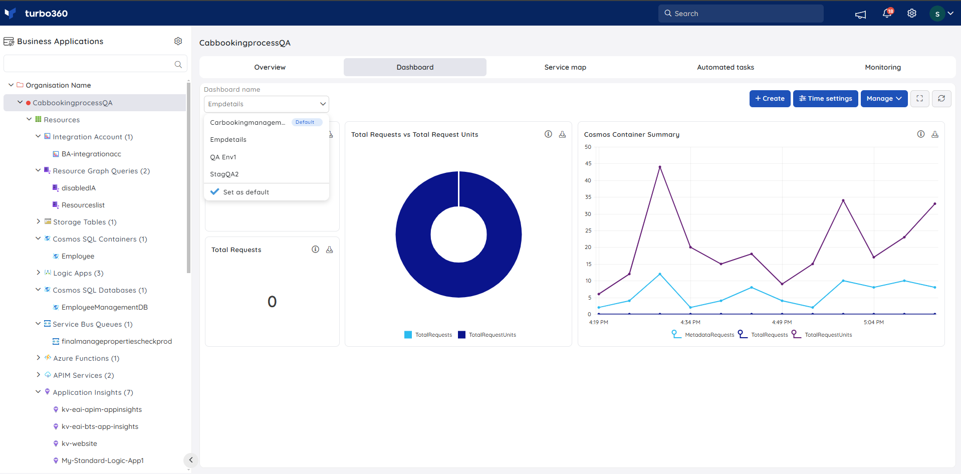
Chart types
Users can select from a variety of charts and group the values based on resources and metrics to best suit their business needs.
Turbo360 supports six types of charts:
- Count chart
- Line chart
- Bar chart
- Area chart
- Pie chart
- Grid chart
Count chart
- Count chart is represented by a single cumulated value of the metric at a given time frame.
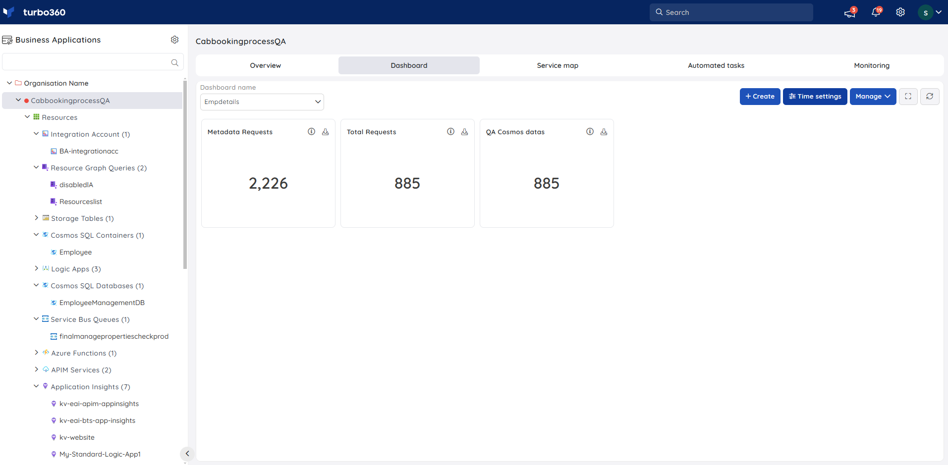
- By hovering over the info icon, users can see a summary of the Count chart widget.
Line chart
Line chart is a Multi Time Series chart that displays date / time on X-axis and data points from a group of selected metrics or resources on Y-axis.
By hovering over the info icon, users can see a summary of the Line chart widget.
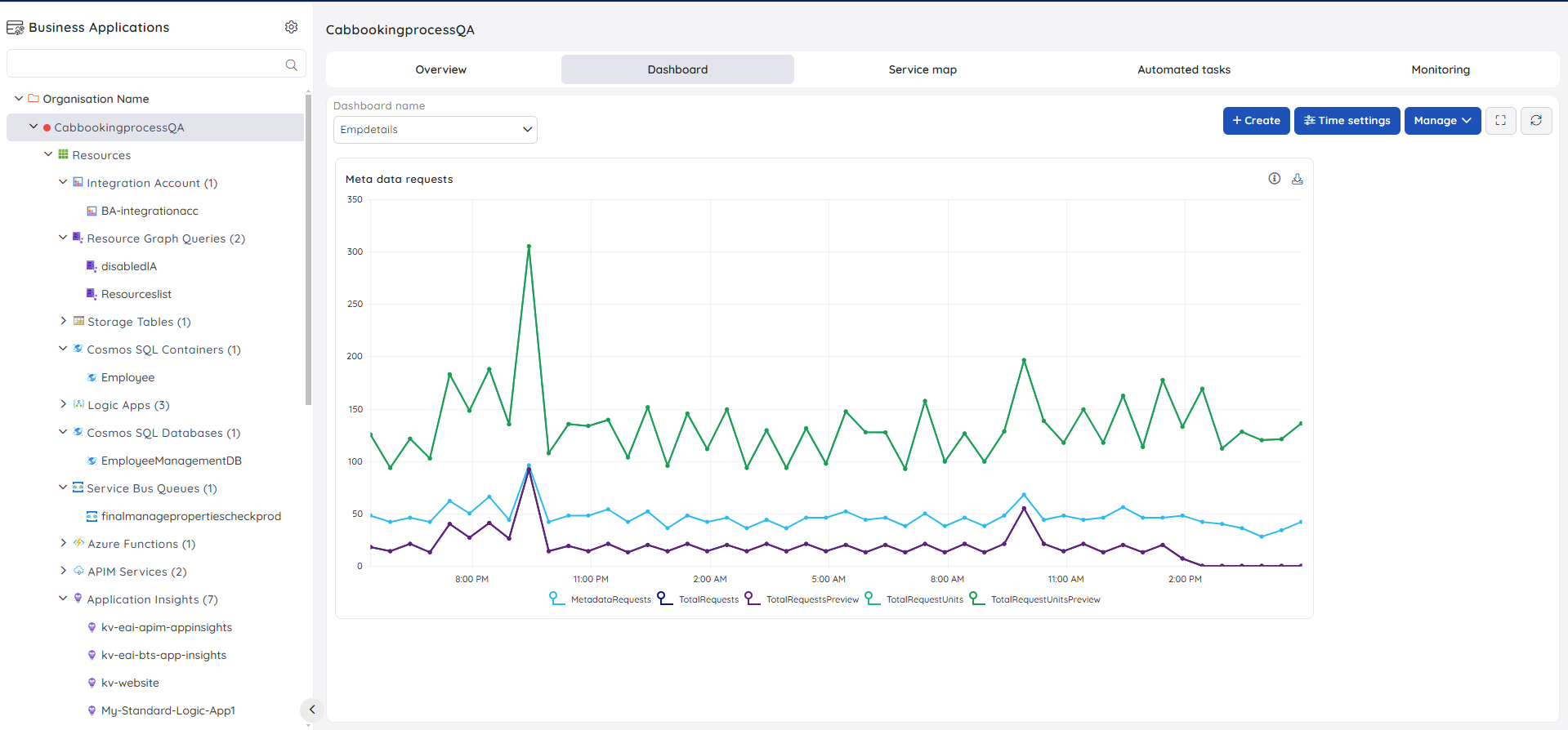
Hover over the data points to see the precise value.
Users can personalise the data visualisation for the Line chart by grouping the real-time data by metric or resource.
Bar chart
Bar chart is a Multi Time Series chart that displays data points on X-axis and the list of metrics / resources on Y-axis.
By hovering over the info icon, users can see a summary of the Bar chart widget.
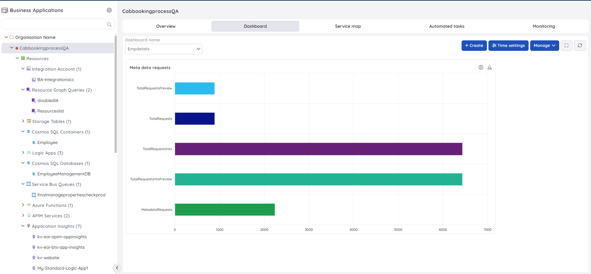
Hover over the bars to see the precise value.
Users can personalise the data visualisation for the Bar chart by grouping the real-time data by metric or resource.
Area Chart
Area chart is a Multi Time Series chart that displays date / time on X-axis and data points from a group of selected metrics or resources on Y-axis.
By hovering over the info icon, users can see a summary of the Area chart widget.
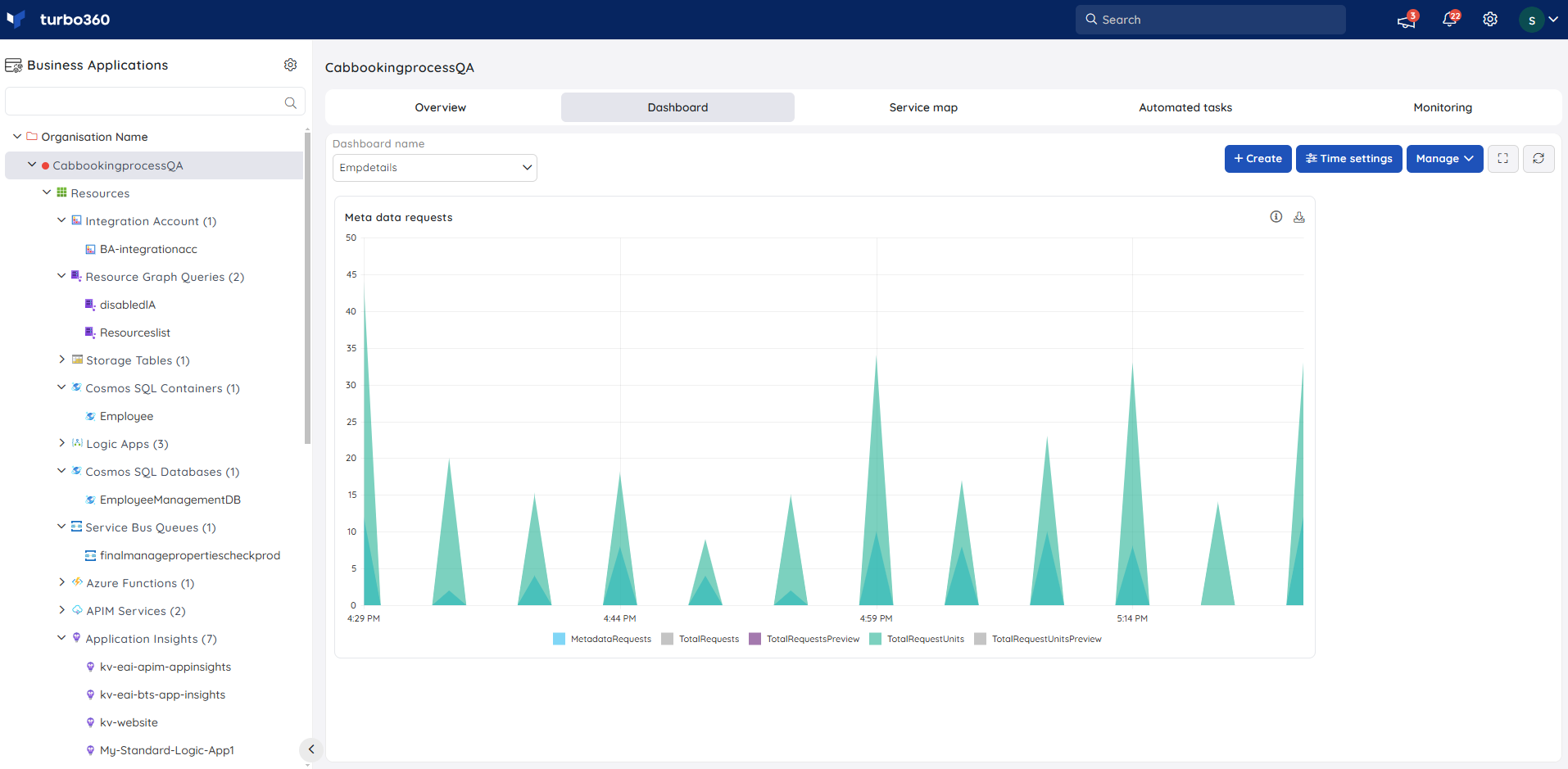
Hover over the areas to see the precise value.
Users can personalise the data visualisation for the Area chart by grouping the real-time data by metric or resource.
Pie Chart
- Pie chart is a circular statistical graphic, which is divided into slices to illustrate numerical proportion. In a pie chart, the arc length of each slice, is proportional to the values of various resources or metrics over a specified time period.
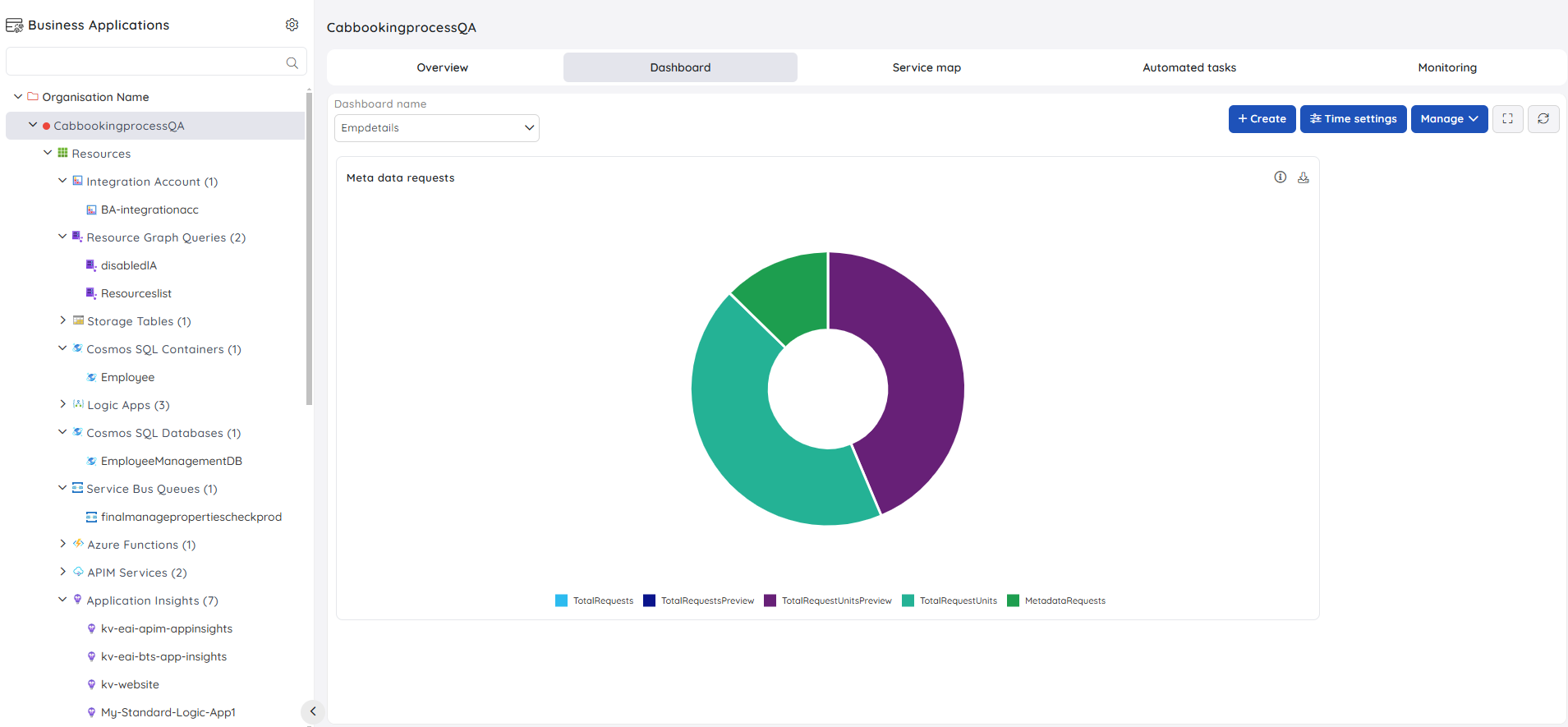
By hovering over the info icon, users can see a summary of the Pie chart widget.
Hover over any of the slices to view the precise values.
- Users can personalise the data visualisation for the Area chart by grouping the real-time data by metric or resource.
Grid
Grid displays the real-time generated data in a table format, allowing users to filter specific columns based on their needs.
By hovering over the info icon, users can see a summary of the Grid widget.
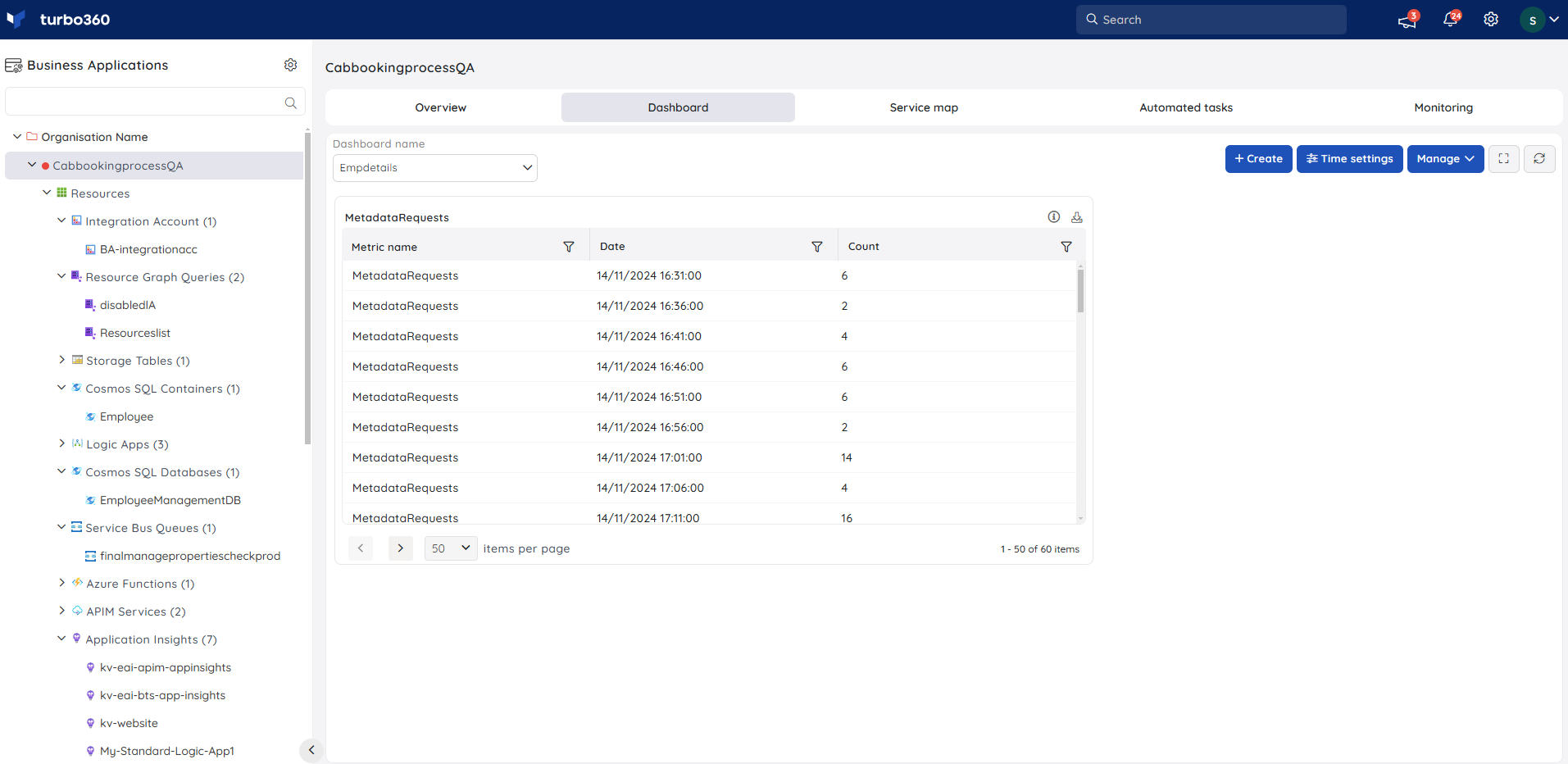
Grid widgets are useful when the real-time generated data is large and it is necessary to know all the essential information from the generated data.
Users can personalise the data visualisation for the Grid by grouping the real-time data by metric or resource.
Widget summary
- Every Dashboard widget has an info button that displays an overview of the widget's configuration.
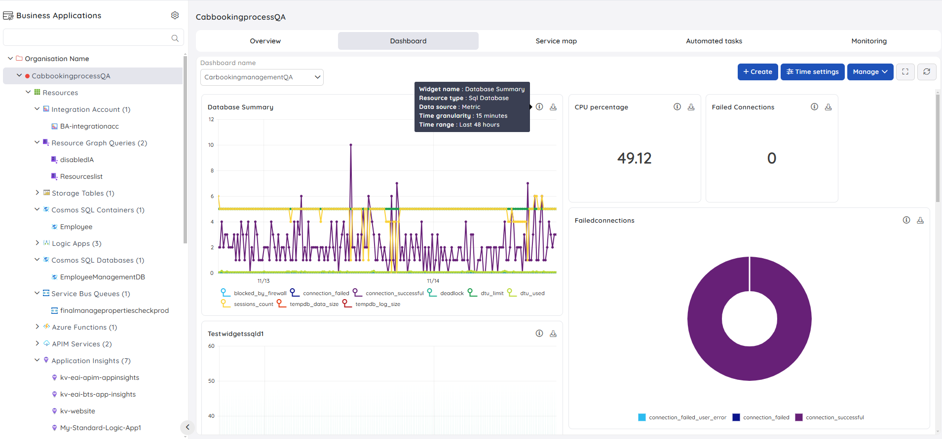
- Each Dashboard widget now has a Download option that allows users to download the summary in an excel sheet.
Default Dashboard
There may be multiple Dashboards for each Business Application.
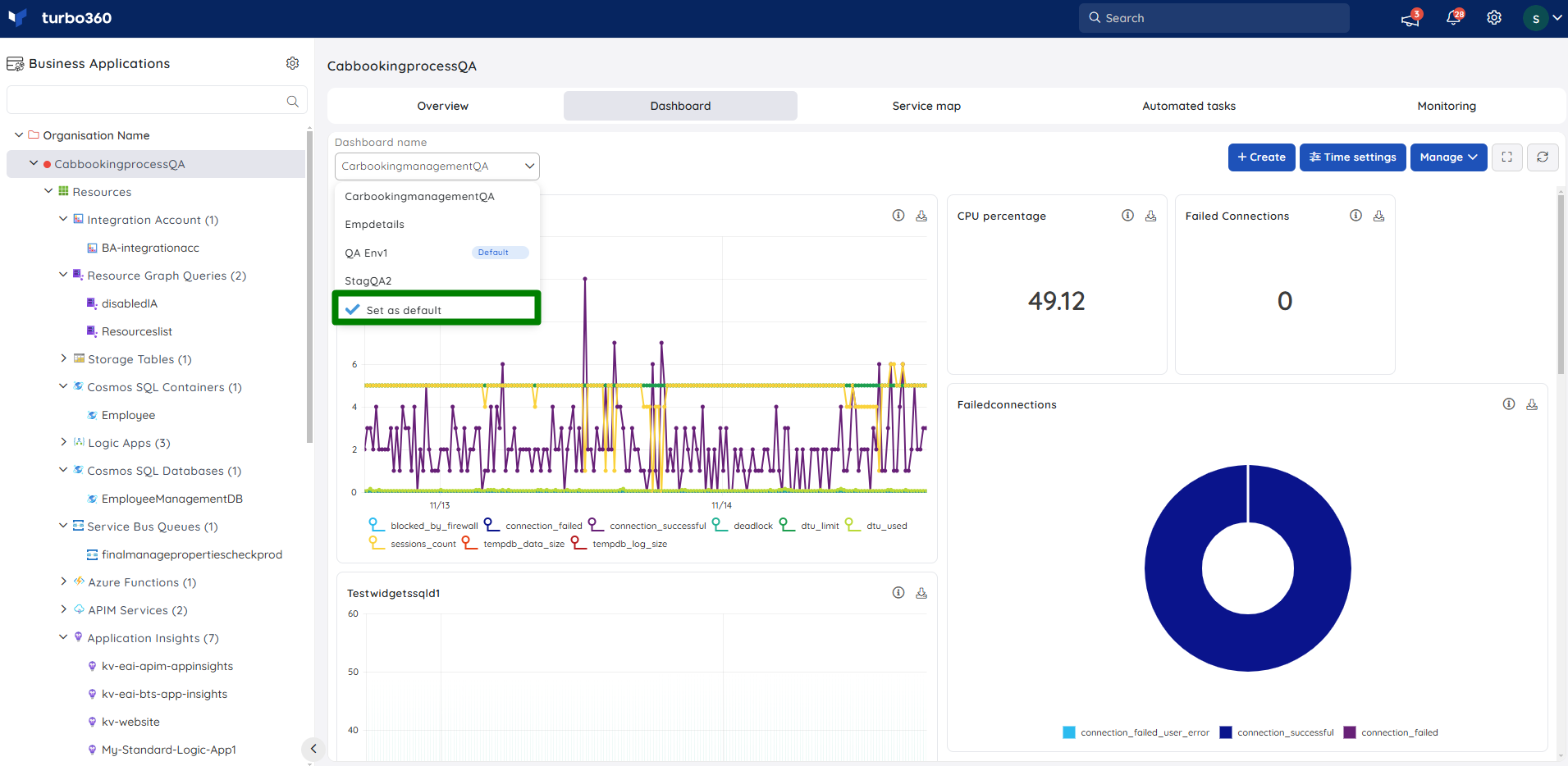
One among the available Dashboards can be set as default by the user, which lands the user to the Default Dashboard when navigated to the Dashboard section.
The Default Dashboard can be changed at any point of time.
