- 19 Nov 2024
- 3 Minutes to read
- Print
- DarkLight
- PDF
Resource Dashboards
- Updated on 19 Nov 2024
- 3 Minutes to read
- Print
- DarkLight
- PDF
Introduction
A Resource Dashboard is a Dashboard that is pre-built into each resource type and allows users to track each resource separately using the Dashboard's features.
Why is it necessary to have a Resource Dashboard?
It is often preferable to provide an individual dashboard for each resource that allows the user to track the resource separately rather than having an overall resource management dashboard.
How to find Resource Dashboard?
Resource Dashboards can be found within the Overview section of all compatible resources.
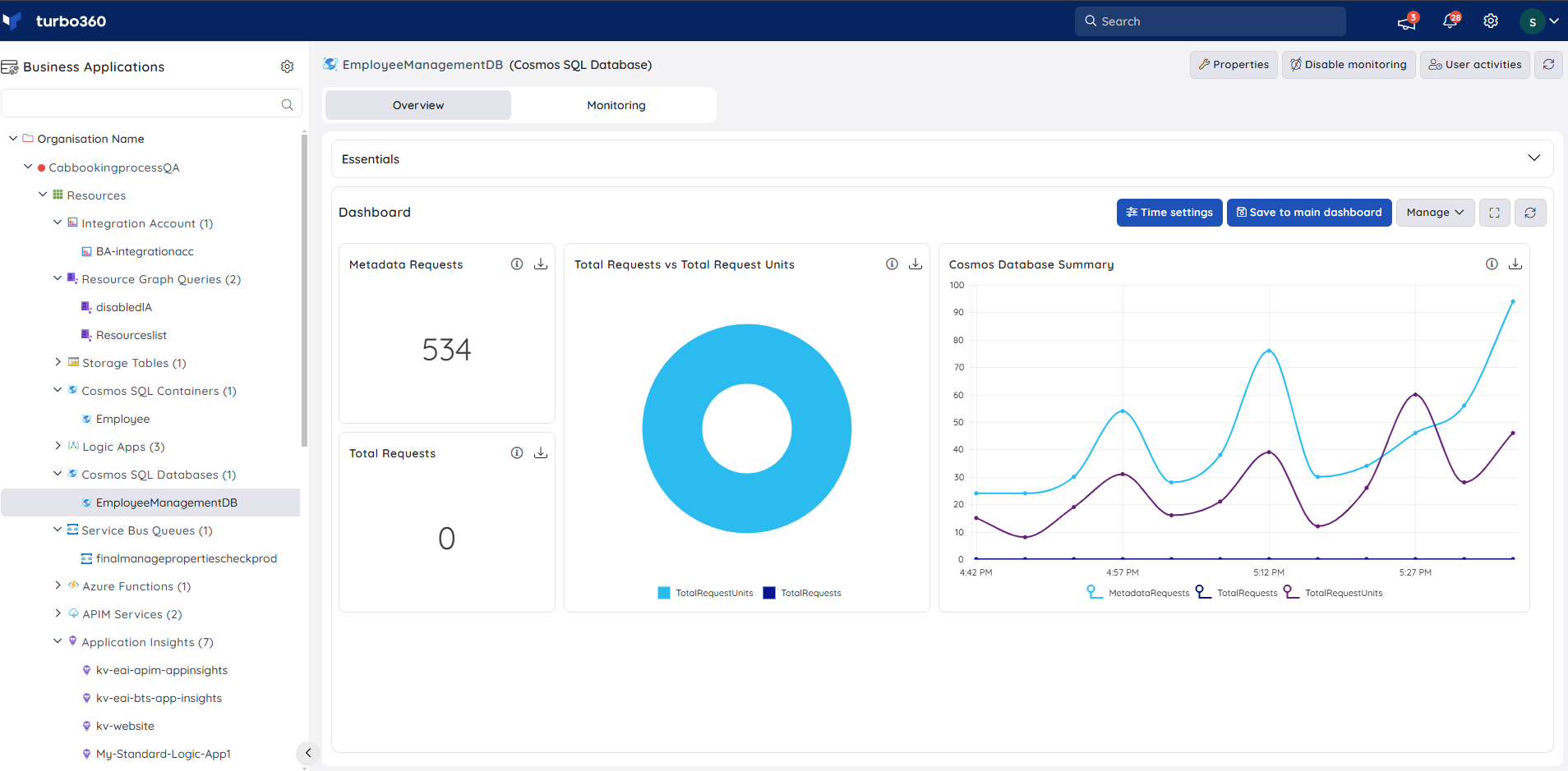
The compatible resource types include:
- API app
- Application Insight
- APIM Service
- APIM API
- APIM Operation
- APIM Product
- Azure Function App
- Cosmos SQL Container
- Cosmos SQL Database
- Cosmos Table
- Data Factory
- Data Factory Pipeline
- Data Factory Integration Runtime
- Event Grid Subscription
- Event Grid Topic
- Event Grid Domain
- Event Grid Domain Subscription
- Event Grid Domain Topic
- Event Hub
- Hybrid Connection
- Log Analytics Workspace
- Logic App
- Logic App (Standard)
- Relay
- Service Bus Queue
- Service Bus Topic
- SQL Database
- SQL Elastic Pool
- Virtual Machine
- Web App
Other than the above-mentioned resource types, the Resource Dashboards are also available for the additionally supported resources, but no widgets are configured. Users can personalise the blank dashboard to suit their needs.
Chart types
Users can select from a variety of charts and group the values based on resources and metrics to best suit their business needs.
Turbo360 supports six types of charts:
- Count chart
- Line chart
- Bar chart
- Area chart
- Pie chart
- Grid chart
Count chart
- Count chart is represented by a single cumulated value of the metric at a given time frame.
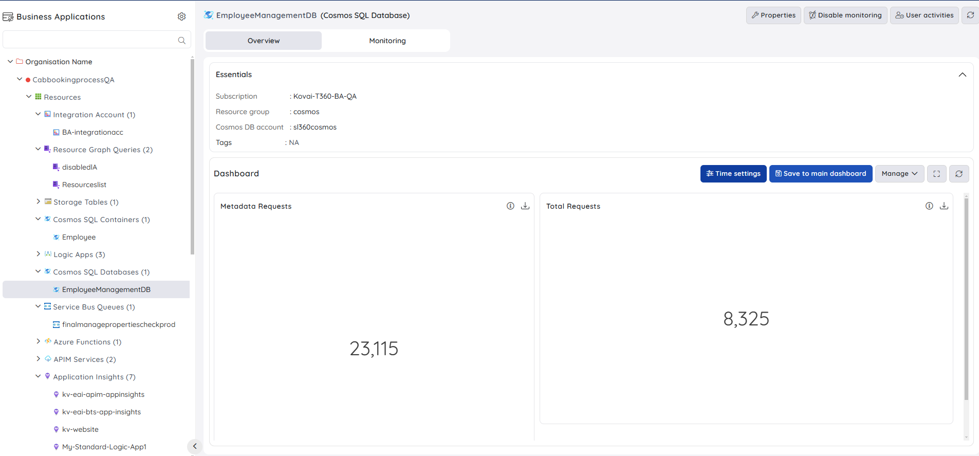
- By hovering over the info icon, users can see a summary of the Count chart widget.
Line chart
Line chart is a Multi Time Series chart that displays date / time on X-axis and data points from a group of selected metrics or resources on Y-axis.
By hovering over the info icon, users can see a summary of the Line chart widget.
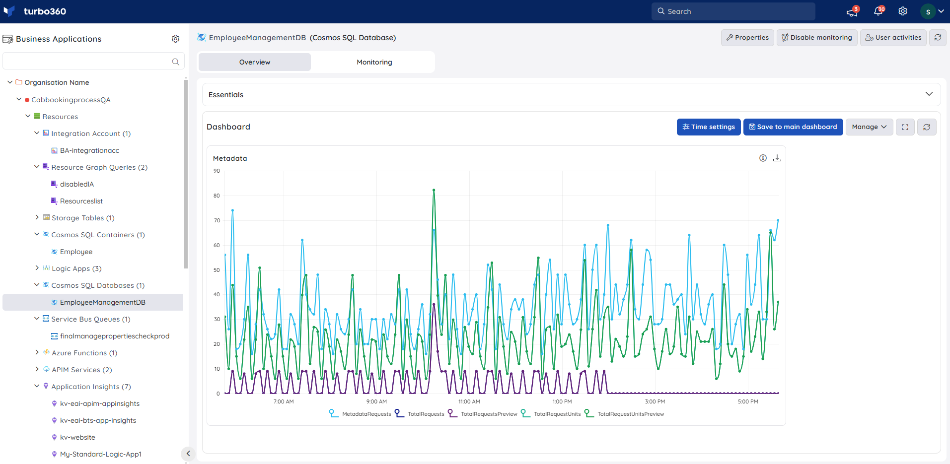
Hover over the data points to see the precise value.
Users can personalise the data visualisation for the Line chart by grouping the real-time data by metric or resource.
Bar chart
Bar chart is a Multi Time Series chart that displays data points on X-axis and the list of metrics / resources on Y-axis.
By hovering over the info icon, users can see a summary of the Bar chart widget.
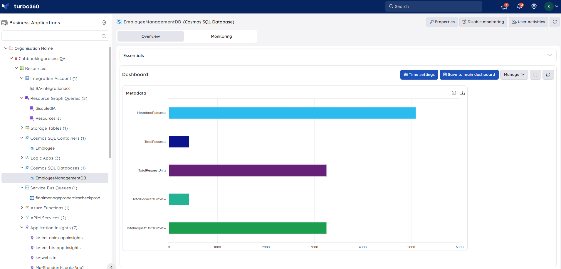
Hover over the bars to see the precise value.
Users can personalise the data visualisation for the Bar chart by grouping the real-time data by metric or resource.
Area Chart
Area chart is a Multi Time Series chart that displays date / time on X-axis and data points from a group of selected metrics or resources on Y-axis.
By hovering over the info icon, users can see a summary of the Area chart widget.
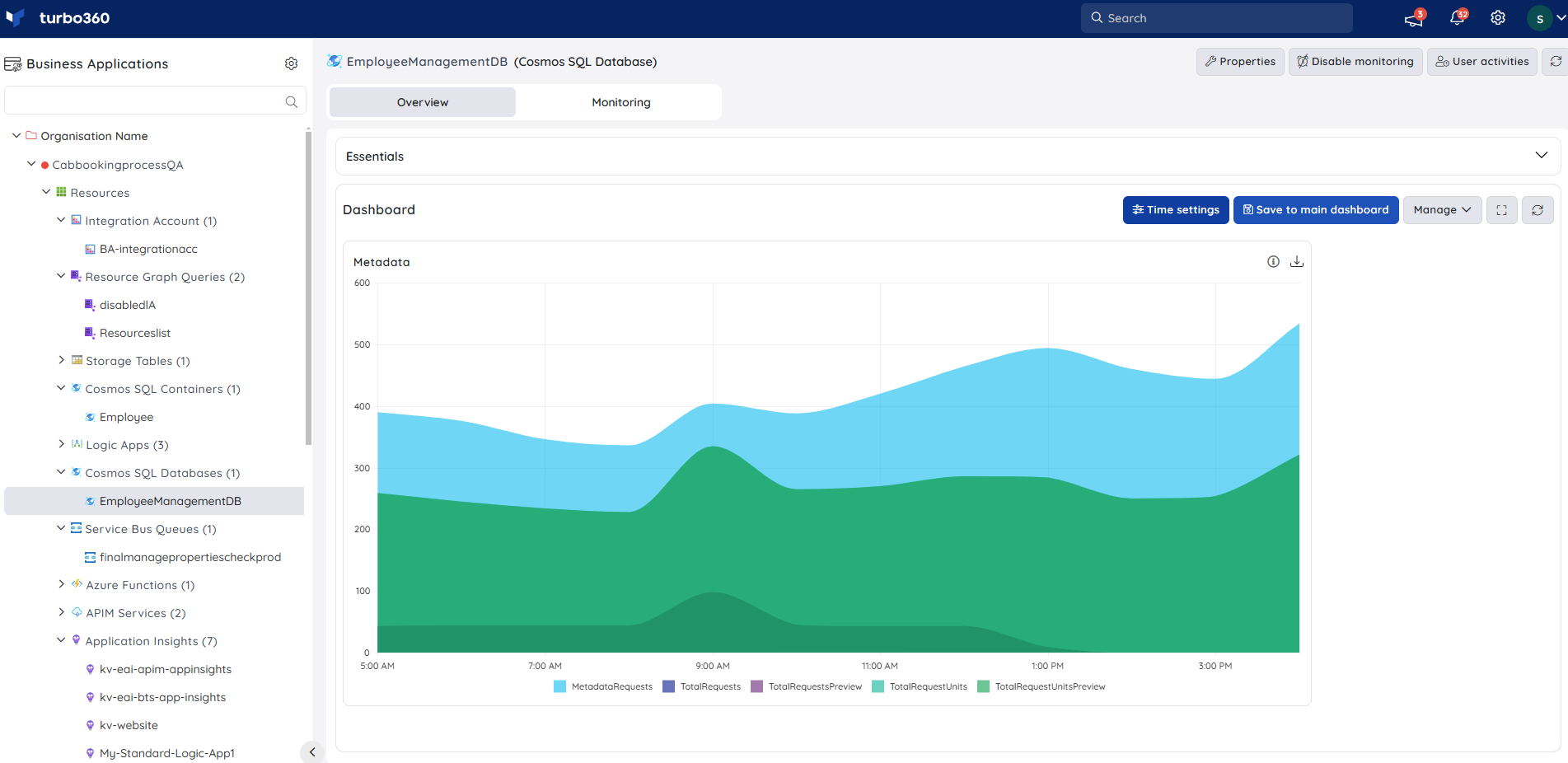
Hover over the areas to see the precise value.
Users can personalise the data visualisation for the Area chart by grouping the real-time data by metric or resource.
Pie Chart
- Pie chart is a circular statistical graphic, which is divided into slices to illustrate numerical proportion. In a pie chart, the arc length of each slice, is proportional to the values of various resources or metrics over a specified time period.
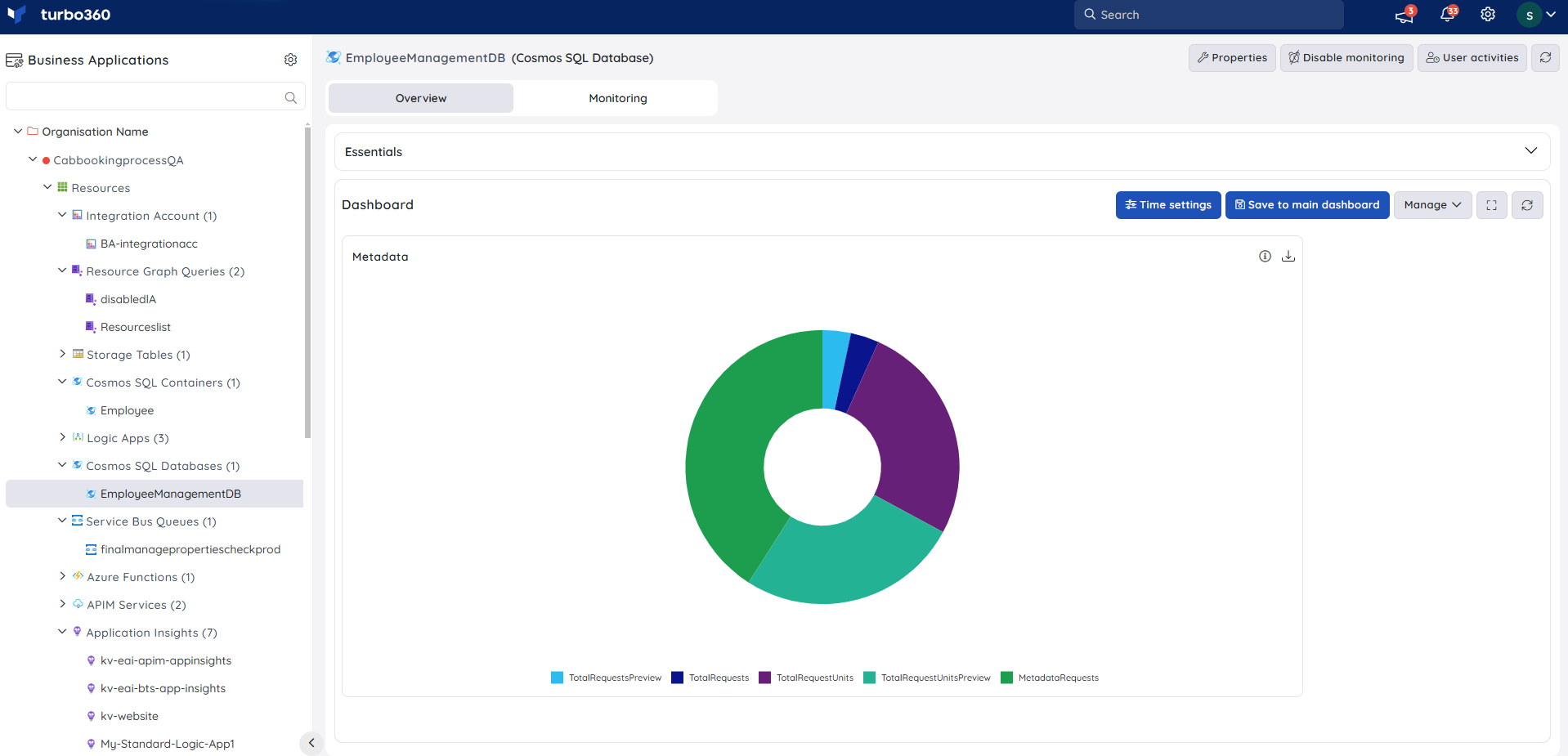
By hovering over the info icon, users can see a summary of the Pie chart widget.
Hover over any of the slices to view the precise values.
- Users can personalise the data visualisation for the Area chart by grouping the real-time data by metric or resource.
Grid Chart
Grid chart displays the real-time generated data in a grid format, allowing users to filter specific columns based on their needs.
By hovering over the info icon, users can see a summary of the Grid chart widget.
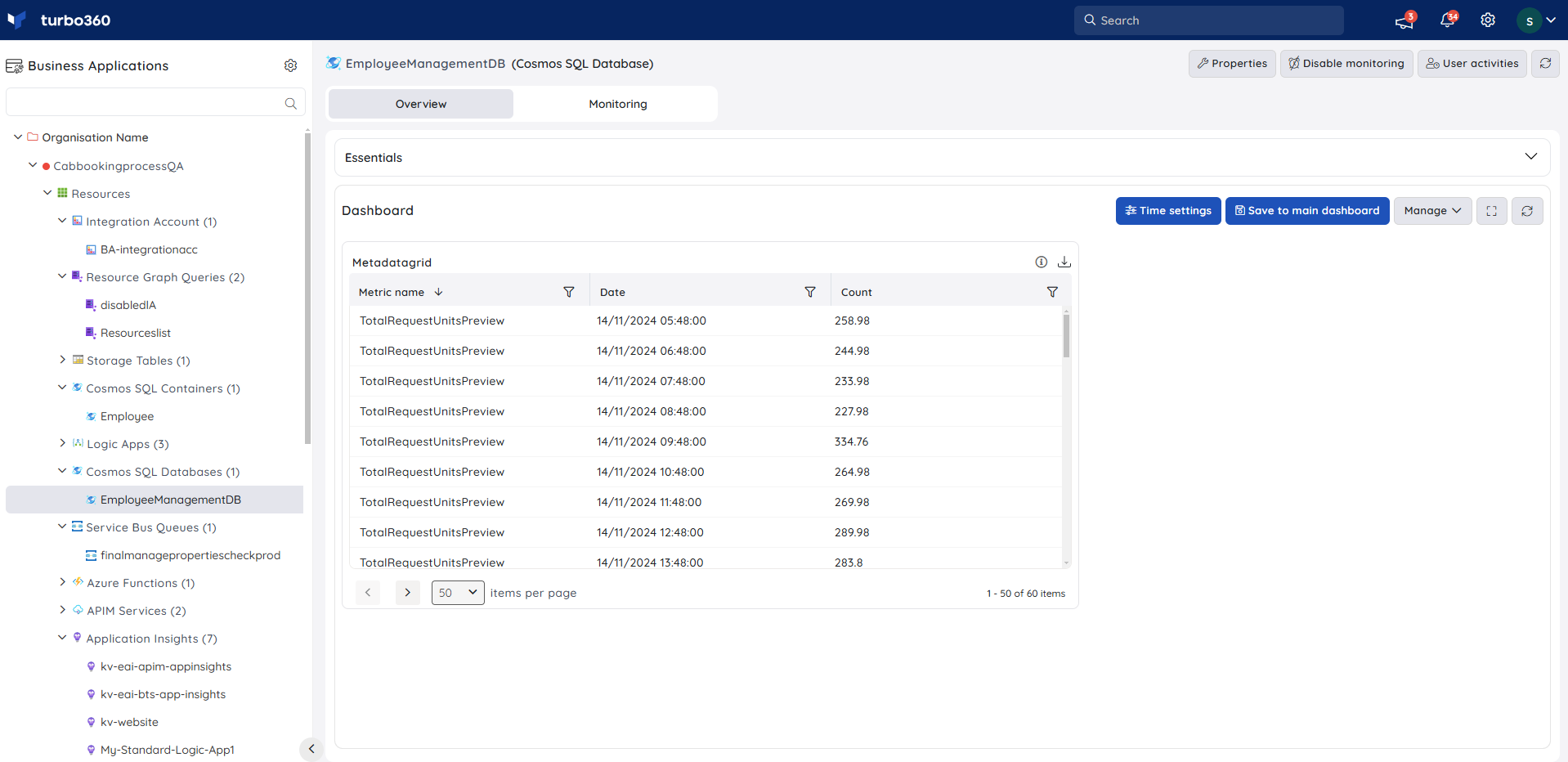
Grid chart widgets are useful when the real-time generated data is large and it is necessary to know all the essential information from the generated data.
Users can personalise the data visualisation for the Grid chart by grouping the real-time data by metric or resource.
Widget summary
- Every Resource Dashboard widget has an info button that displays an overview of the widget's configuration.
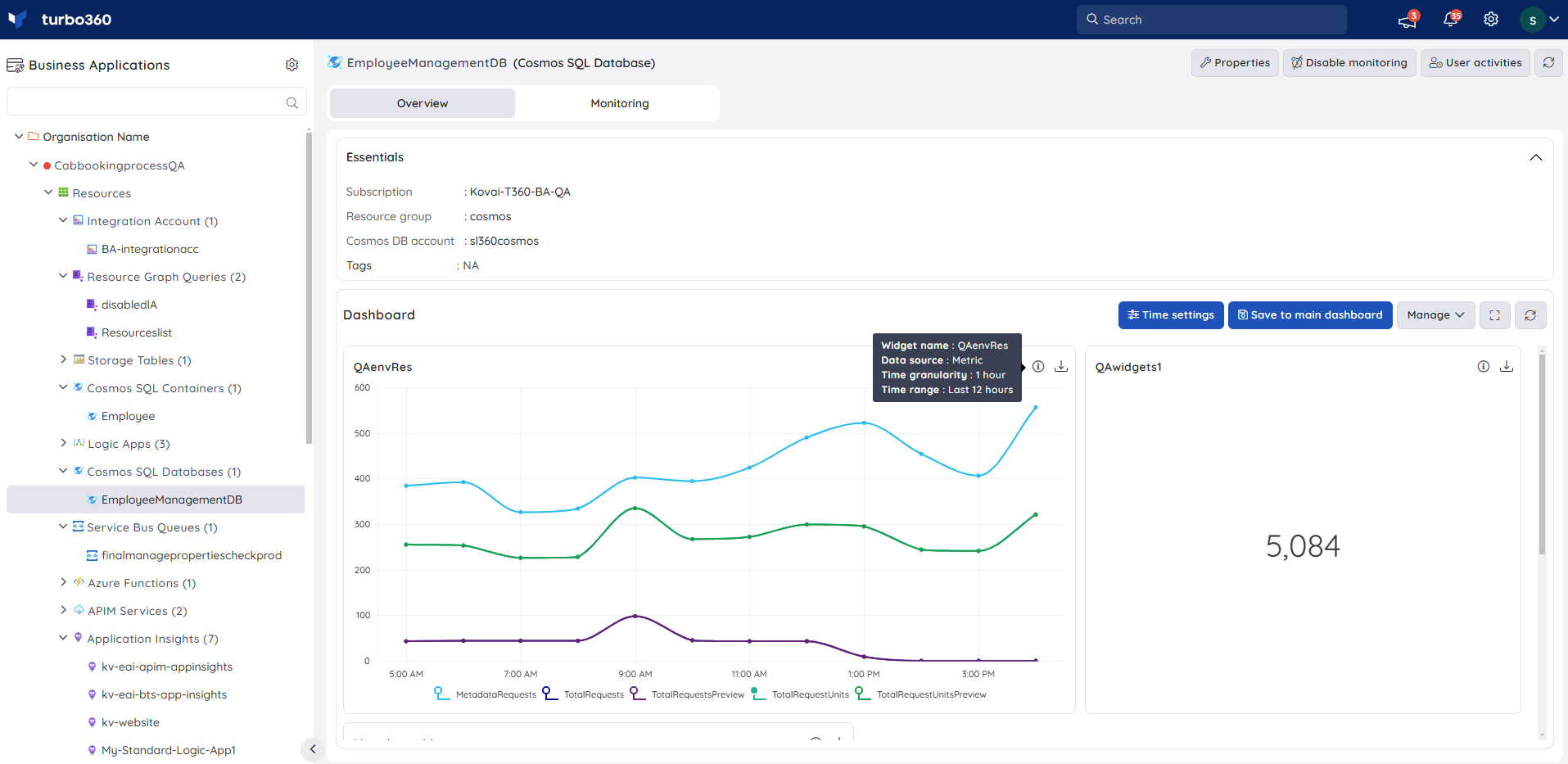
- Each Resource Dashboard widget now has a Download option that allows users to download the summary in an excel sheet.

