

Business Application dashboard
- 05 Aug 2026
- 5 Minutes to read
- Print
- DarkLight
- Download PDF
Business Application dashboard
- Updated on 05 Aug 2026
- 5 Minutes to read
- Print
- DarkLight
- Download PDF
Article summary
Did you find this summary helpful?
Thank you for your feedback!
Overview
The Business Application dashboard in Turbo360 gives you a centralized view of the metrics and operational data that matter most to your business scenario. Each Business Application can have multiple dashboards, and each dashboard is made up of customizable widgets that you can configure, arrange, and resize to reflect your current priorities.
Business value
A well-structured Business Application dashboard reduces the time you spend switching between Azure resources to assess operational health. You can surface the most relevant metrics for your team in a single view, set a default dashboard for faster access, and download widget data for offline reporting — all without leaving Turbo360.
How it works
Each dashboard widget is independently configured with a metric source, chart type, and time range. Turbo360 fetches real-time data for each widget based on its configuration and renders it within the dashboard layout. Widgets can be added, edited, reordered, and resized at any time. One dashboard per Business Application can be set as the default, which loads automatically when you navigate to the Dashboard section.
Permissions
Dashboard access is controlled by the Dashboard feature permission in your role configuration.
| Permission level | What you can do |
|---|---|
| Read | View all dashboards within the Business Application |
| Manage | Add, edit, delete, and reorder widgets; set the default dashboard; save resource dashboards to the main Business Application dashboard |
Users with only resource-level Read access and Dashboard Read permission can view resource dashboard widgets but cannot update them or save a resource dashboard to the main Business Application dashboard.
Users with resource-level Manage access and Dashboard Read permission can manage resource dashboard widgets but cannot save to the main Business Application dashboard. Dashboard Manage permission is required to save resource dashboards to the main Business Application dashboard.
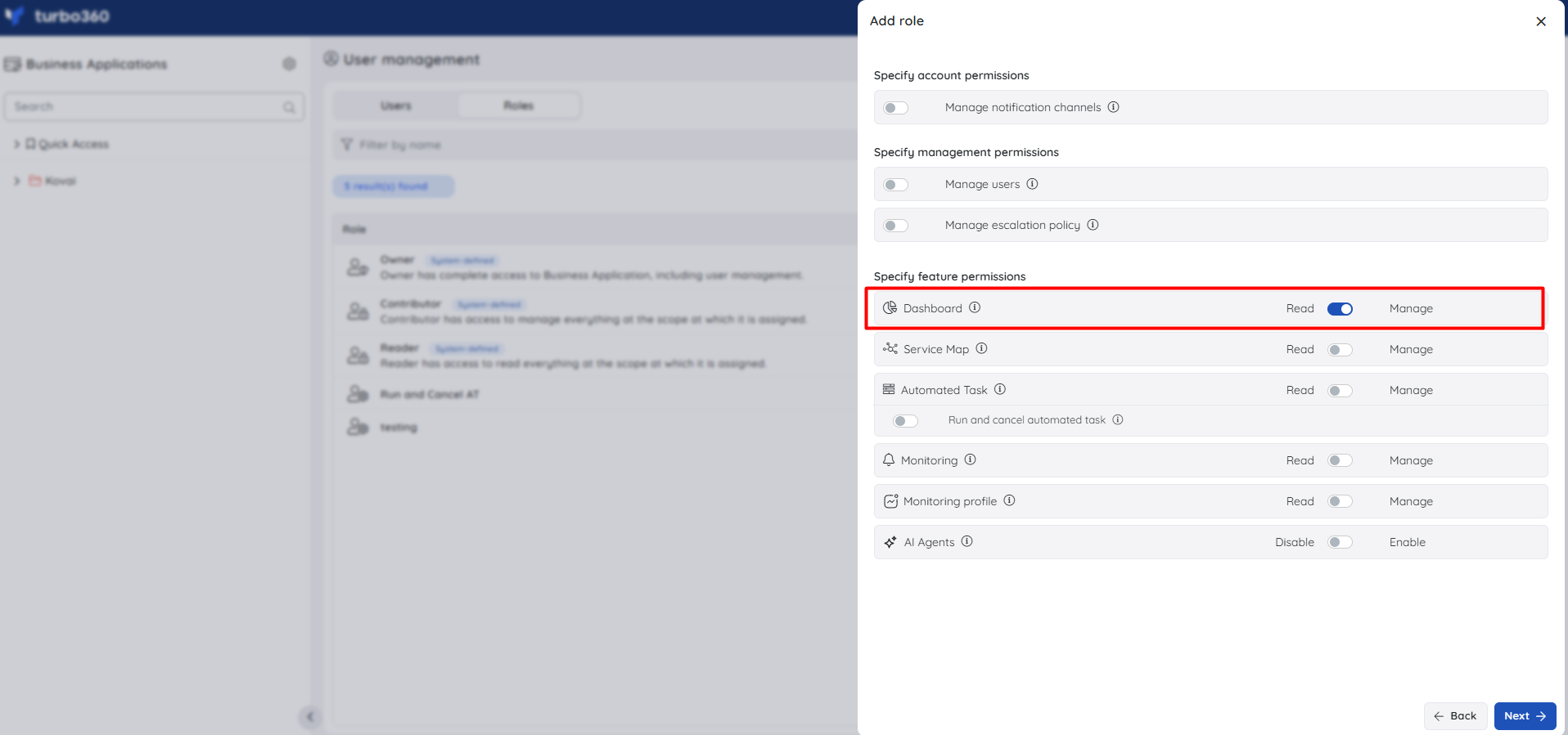
Chart types
Each widget uses one of six chart types. Select the chart type that best represents your metric data.
Turbo360 supports the following chart types:
| Chart type | What it displays |
|---|---|
| Count chart | A single cumulated value of the metric at a given time frame — useful for point-in-time totals such as run counts or failure counts |
| Line chart | A multi-time-series chart with date/time on the X-axis and metric or resource data points on the Y-axis — useful for trend analysis over time |
| Bar chart | A multi-time-series chart with data points on the X-axis and metrics or resources on the Y-axis — useful for comparing values across resources |
| Area chart | A multi-time-series chart similar to the line chart, with the area below the line filled — useful for visualising cumulative volume over time |
| Pie chart | A circular chart divided into proportional slices representing the relative values of resources or metrics over a time period — useful for distribution breakdowns |
| Grid | Displays real-time data in a table format with filterable columns — useful when you need to see all data points across a large dataset |
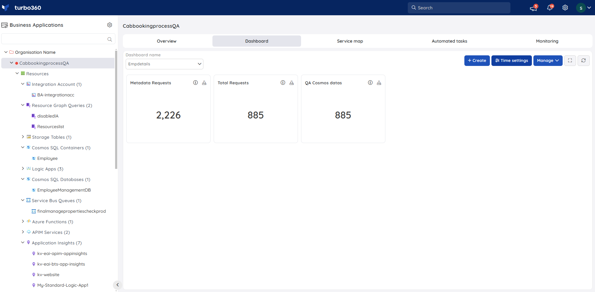
Count chart
A Count chart shows a single cumulated value for the selected metric within the configured time frame. Hover over the info icon to see a summary of the widget's configuration.
Line chart
A Line chart is a multi-time-series chart that plots date/time on the X-axis and data points from one or more metrics or resources on the Y-axis. Hover over a data point to see its precise value. You can group the data by metric or by resource. Hover over the info icon to see the widget summary.
.png)
Bar chart
A Bar chart is a multi-time-series chart that plots data points on the X-axis and metrics or resources on the Y-axis. Hover over a bar to see its precise value. You can group the data by metric or by resource. Hover over the info icon to see the widget summary.
.png)
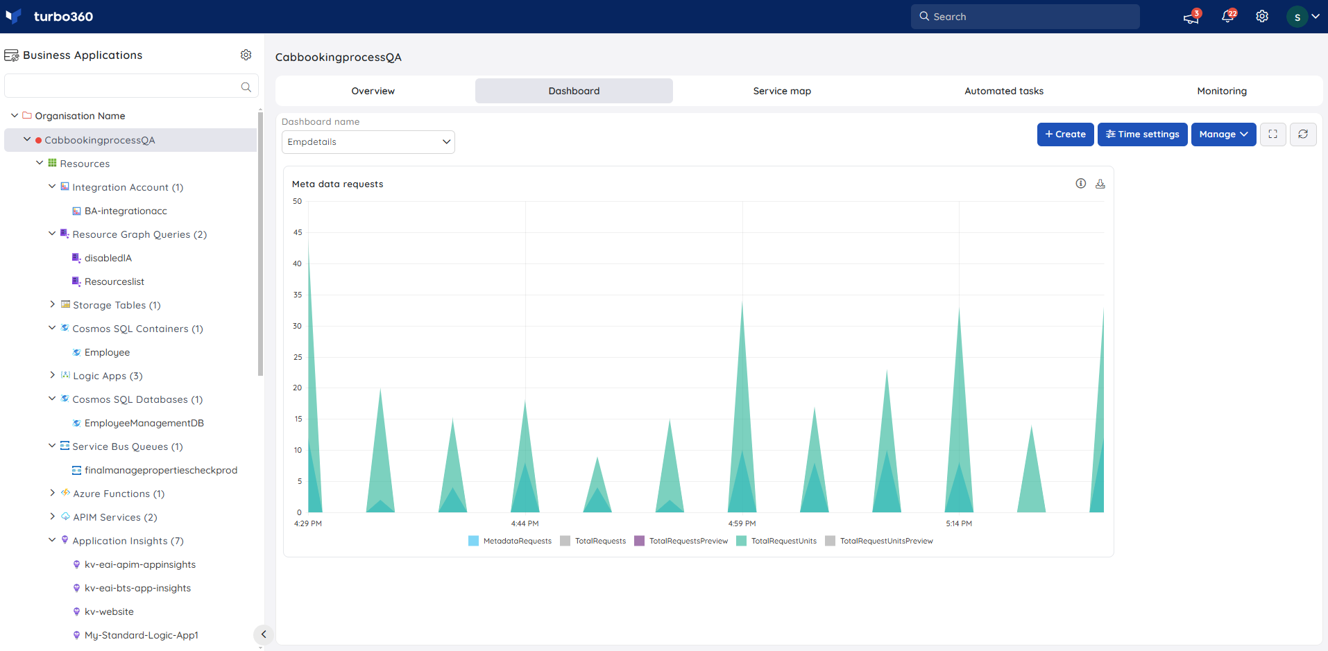
Area chart
An Area chart is a multi-time-series chart that plots date/time on the X-axis and fills the area below the line for each metric or resource. Hover over the filled area to see precise values. You can group the data by metric or by resource. Hover over the info icon to see the widget summary.
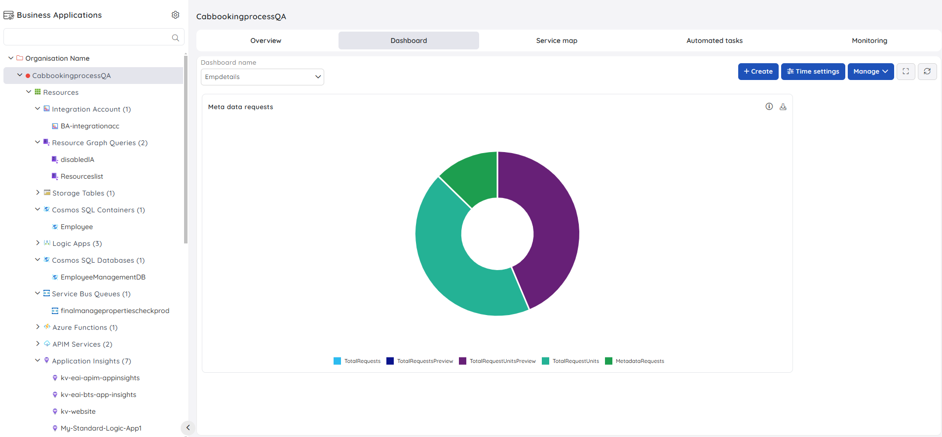
Pie chart
A Pie chart divides data into proportional slices, where the arc length of each slice represents the relative value of a resource or metric over the selected time period. Hover over a slice to see its precise value. You can group the data by metric or by resource. Hover over the info icon to see the widget summary.
Grid
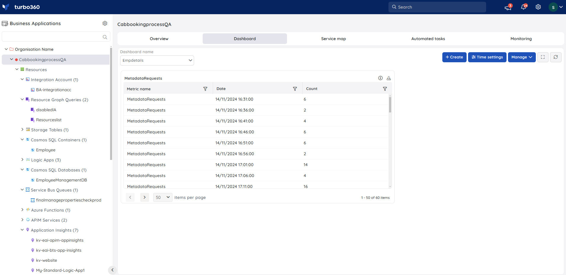
A Grid widget displays real-time data in a table format. You can filter specific columns to focus on the data that is most relevant. Grid widgets are most useful when the dataset is large and you need to inspect individual data points across all resources. You can group the data by metric or by resource. Hover over the info icon to see the widget summary.
Widget summary
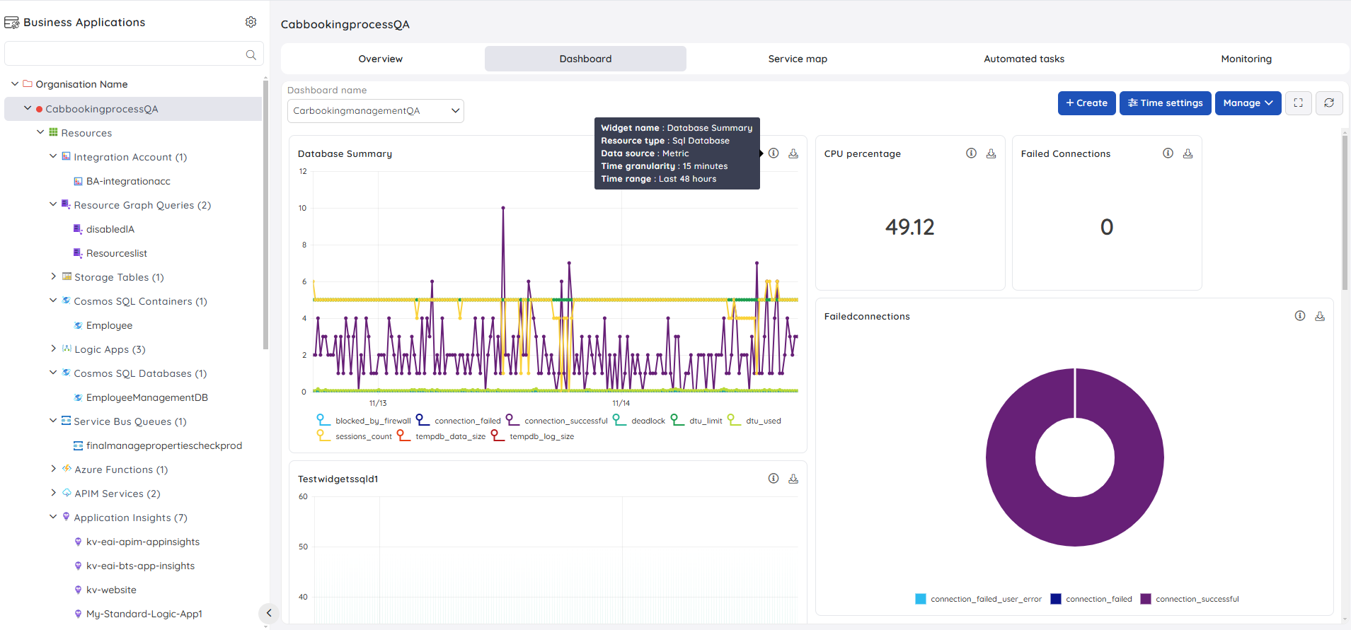
Every dashboard widget has an info button that shows an overview of the widget's configuration — including the metric source, time range, and grouping. Each widget also has a Download option that exports the widget data as an Excel file.
Default dashboard
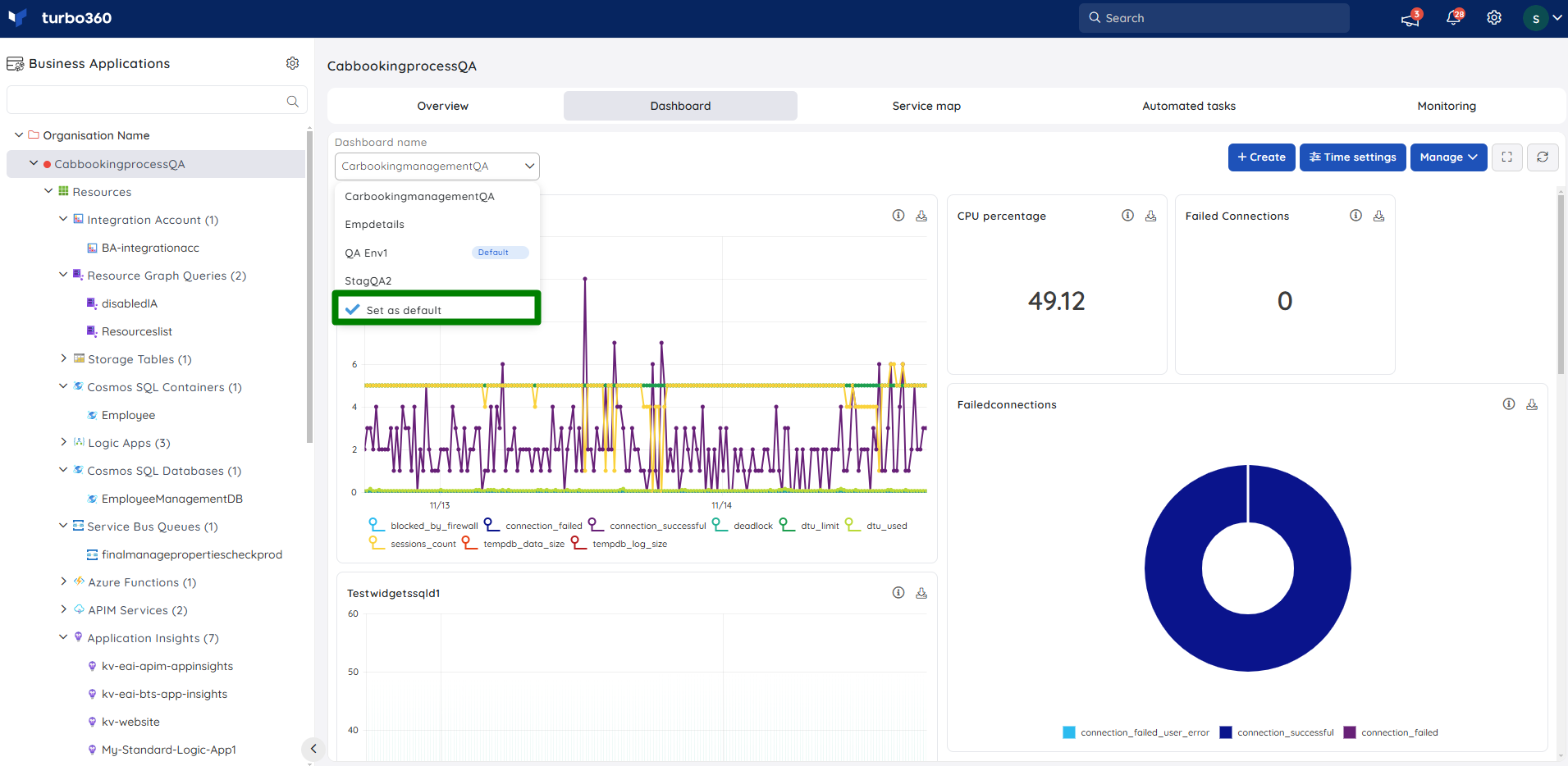
A Business Application can have multiple dashboards. You can set any one of them as the default. The default dashboard loads automatically when you navigate to the Dashboard section of the Business Application. You can change the default dashboard at any time.
Troubleshooting
Dashboard loads but widgets show no data
Cause: The time range or granularity is set to a window with no metric activity, or the underlying Azure resource has not emitted data.
Fix: Adjust the time range to a wider window. Confirm that the Azure resource is active and that the metric source is correctly configured in the widget.Widget info icon shows an incorrect metric name
Cause: The widget was created with a metric that has since been renamed or removed in Azure.
Fix: Edit the widget and re-select the correct metric from the current list.Download produces an empty Excel file
Cause: There is no data within the selected time window for the widget's metric.
Fix: Expand the time range and re-download.Default dashboard does not load on navigation
Cause: The dashboard set as default was deleted, or the role does not have Dashboard Read permission.
Fix: Set another dashboard as default, or confirm that the user's role includes Dashboard Read permission.Cannot set a dashboard as default
Cause: The user has only Dashboard Read permission; setting a default requires Dashboard Manage permission.
Fix: Assign Dashboard Manage permission to the user's role.
Related articles
Was this article helpful?