

Cost analysis
- 09 Aug 2026
- 10 Minutes to read
- Print
- DarkLight
- Download PDF
Cost analysis
- Updated on 09 Aug 2026
- 10 Minutes to read
- Print
- DarkLight
- Download PDF
Article summary
Did you find this summary helpful?
Thank you for your feedback!
Overview
The Analysis view in Cost Analyzer lets you explore and visualize Azure spending in detail using flexible filters, groupings, and chart types — so you can track usage patterns, compare cost trends, and surface optimization opportunities across your subscriptions.
Business value
Analysis helps you spot spending anomalies and inefficiencies earlier, compare costs across resources, locations, tags, and other filter types, and make data-driven optimization decisions — cutting the manual effort of building equivalent views directly in the Azure portal.
Prerequisites
Required permissions
| Role | Permission level | Access |
|---|---|---|
| Account owner, Owner, Contributor | — | Full access to the Analysis section, including Explain with AI |
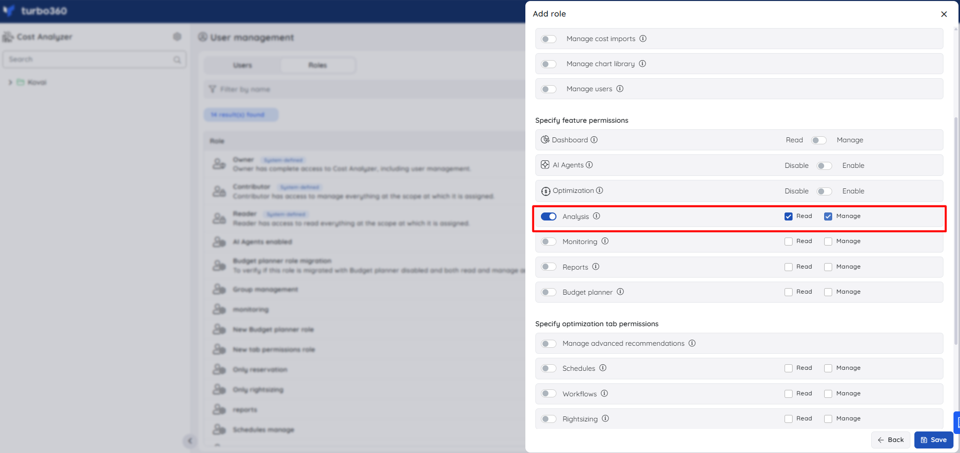
| Analysis role | Manage | Can perform all operations in the Analysis section |
| Analysis role | Read | Can only view the Analysis section; cannot perform operations |
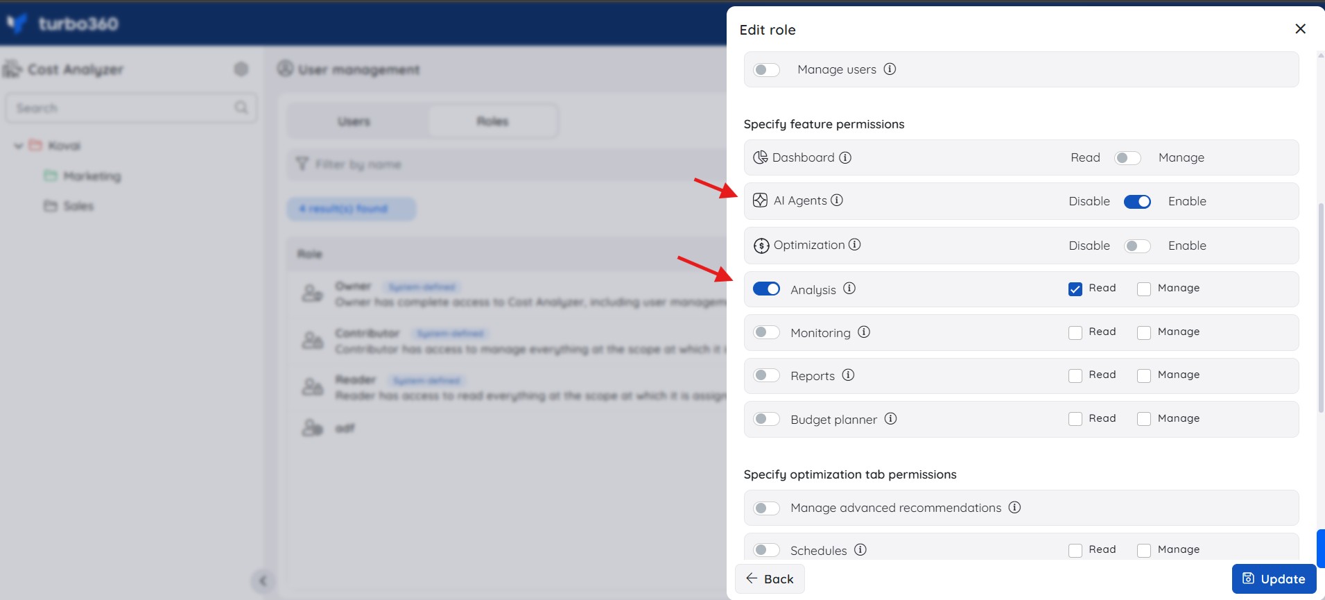
| Custom role | AI Agents — Enable, Analysis — Read (or Manage) | When AI Agents is set to Enable and Analysis is toggled on with at least Read access, the user can open the Explain with AI panel; if either is missing, the option is not available |
How it works
- Each saved view visualizes your Azure subscription costs as charts or tables. You build a view from a set of filters — subscriptions, time interval, granularity, currency, group by, and chart format — and Cost Analyzer renders the result.
- Multi-layered filtering lets you combine several filters at once for deeper, more targeted analysis.
- Click any chart data point to expand the filtered data into a new chart for further drill-down.
- Switch between Actual cost (raw usage and purchases as they appear on the invoice) and Amortized cost (reservation charges spread evenly across the term and linked to the resources that used them) using the Metric filter.
- Group related saved views into collections to organize them by team, project, or use case instead of keeping every view in one flat list — see Managing analysis views.
Forecasting
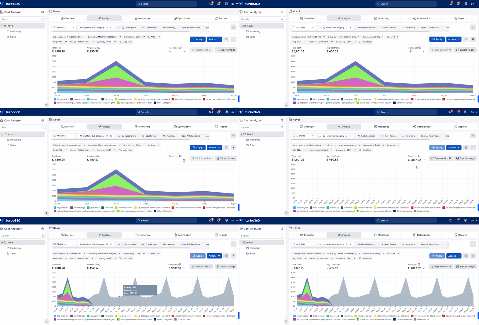
Forecast estimates potential future expenditure based on resource and service usage, helping you anticipate and manage your budget.
Forecasting is available only for time ranges that include the current date or a future date. To view a forecast:
- In the Analysis view, select This Week, This Month, This Quarter, or This Year.
- Set Granularity to any value other than None.
- Choose a chart type other than Table.
- Click Apply.
Notes:
- The forecast is based on resource and service usage within the subscription. Purchases are not factored into the prediction.
- Usage changes may take about a week to be reflected in the forecast.
Cache behavior
Cost Analyzer caches view data to improve performance and reduce load times. Cached data may not always reflect the latest cost updates, so saved views occasionally need a manual cache reset.
Cost Analyzer runs a daily cache reset automatically when the date rolls over.
To reset the cache manually, go to Actions > Reset cached data within a saved view.
.png)
Reset the cache when:
- The displayed cost data looks outdated or inconsistent with recent updates.
- You've made major changes to the underlying cost group, such as an updated scope.
- You hit performance issues, delays, or data errors related to cached content.
Explain with AI
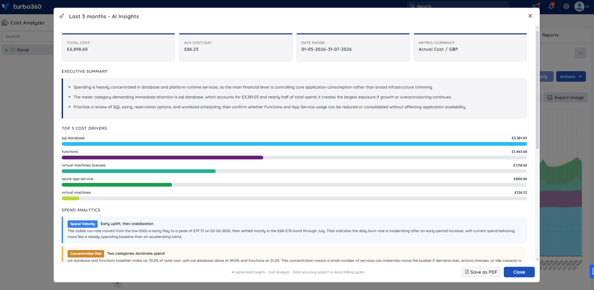
Explain with AI is a built-in AI capability in the Analysis view that generates a structured breakdown of the current chart data — covering cost drivers, spend patterns, anomalies, and optimization opportunities. It turns a raw cost chart into a ready-made narrative, saving teams from manually cross-referencing categories, trends, and anomalies to understand why spend moved.
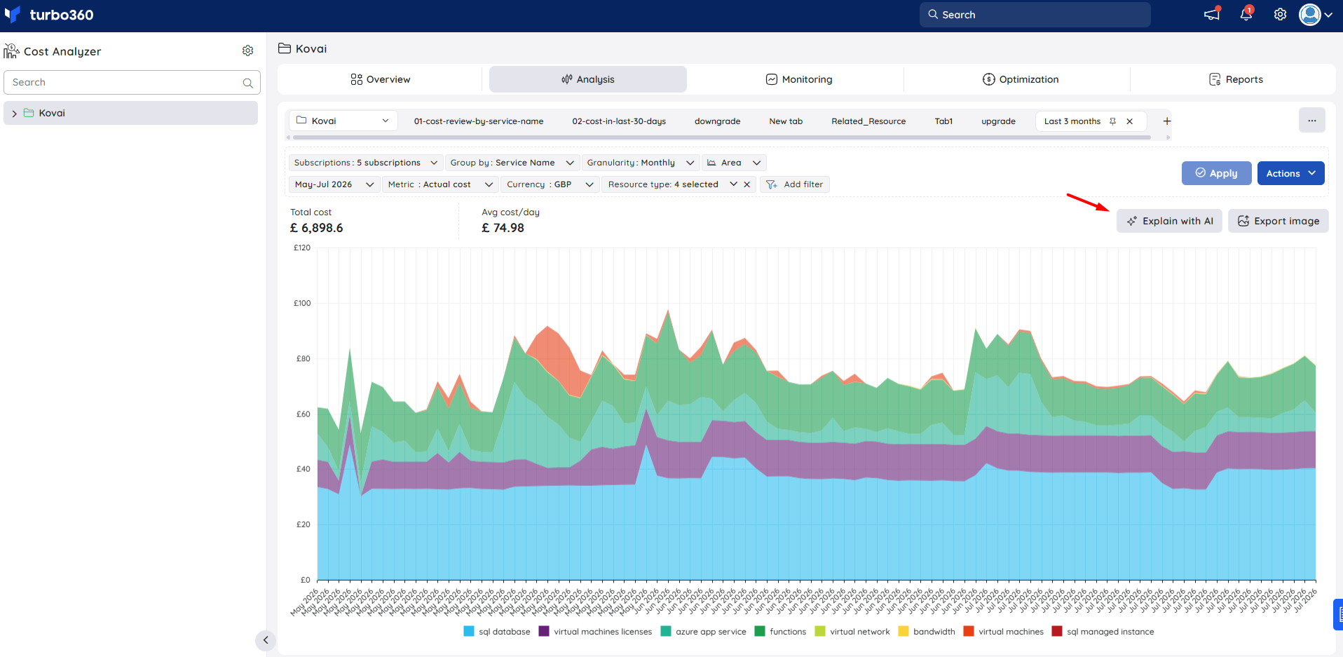
To use Explain with AI:
- Open or configure a chart view for the desired Cost management group, subscription, and date range. Apply any grouping dimensions, filters, or chart types as needed.
- Click the Explain with AI button in the top-right corner of the chart area.
- The AI Insights panel opens with a full analysis of the current chart data. Review each section in sequence or jump to the section most relevant to your question.
- To save the full report, click Save as PDF from the panel header.
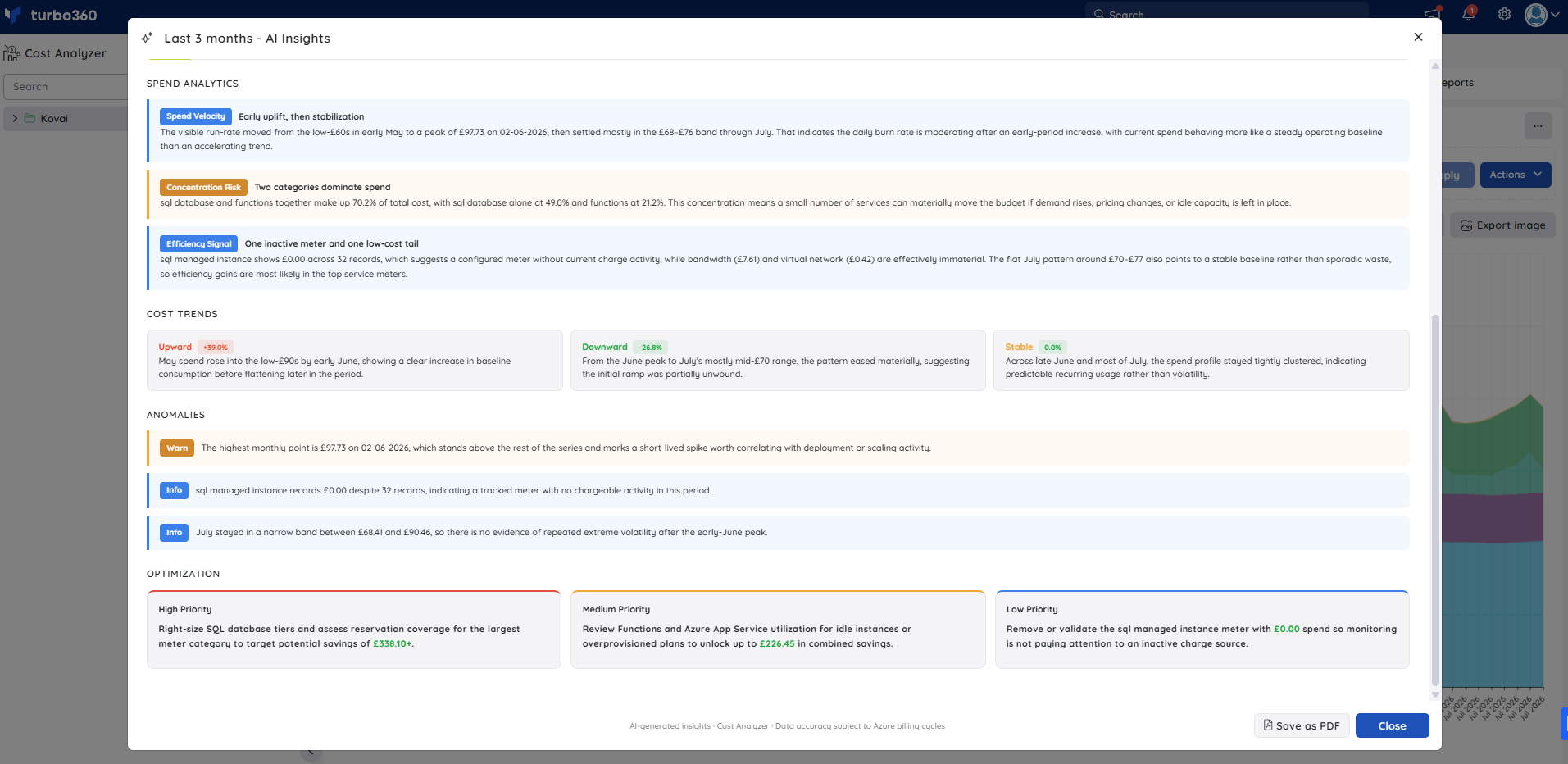
The AI Insights panel includes six sections:
- Executive summary — a concise overview of the dominant spending categories, the largest cost lever, and the most impactful area to prioritize.
- Top 5 cost drivers — the five highest-spend categories ranked by total cost, with a proportional bar for quick visual comparison.
- Spend analytics — three labeled signals derived from the chart data: Spend velocity (daily burn rate pattern), Concentration risk (when a small number of categories drive a disproportionate share of cost), and Efficiency signal (near-zero or inactive meters that may indicate idle resources or misconfigured tracking).
- Cost trends — directional patterns across the date range using three labeled trend cards — Upward, Downward, and Stable — each with a percentage change and a plain-language explanation of what drove it.
- Anomalies — notable deviations from baseline spend, including severity-labeled alerts (Warn, Info) for spikes, unexpected patterns, and low-activity meters with context on possible causes.
- Optimization — prioritized recommendations across High Priority, Medium Priority, and Low Priority, each with an estimated monthly saving in the chart's currency.
The full report can be exported using Save as PDF. The exported PDF reproduces all six insight sections along with the chart metadata — total cost, avg cost/day, date range, metric, and currency.
Cost intelligence view
The Cost intelligence view breaks down resource-level cost data into distinct categories and visual sections, giving you a detailed view of cost distribution and utilization, and flagging areas of high or low resource efficiency.
This view becomes available only when:
- Group by is set to Resource, and
- Chart format is set to Table.
Clicking a resource from the grid then opens the Cost intelligence view for that resource.
.png)
The view includes:
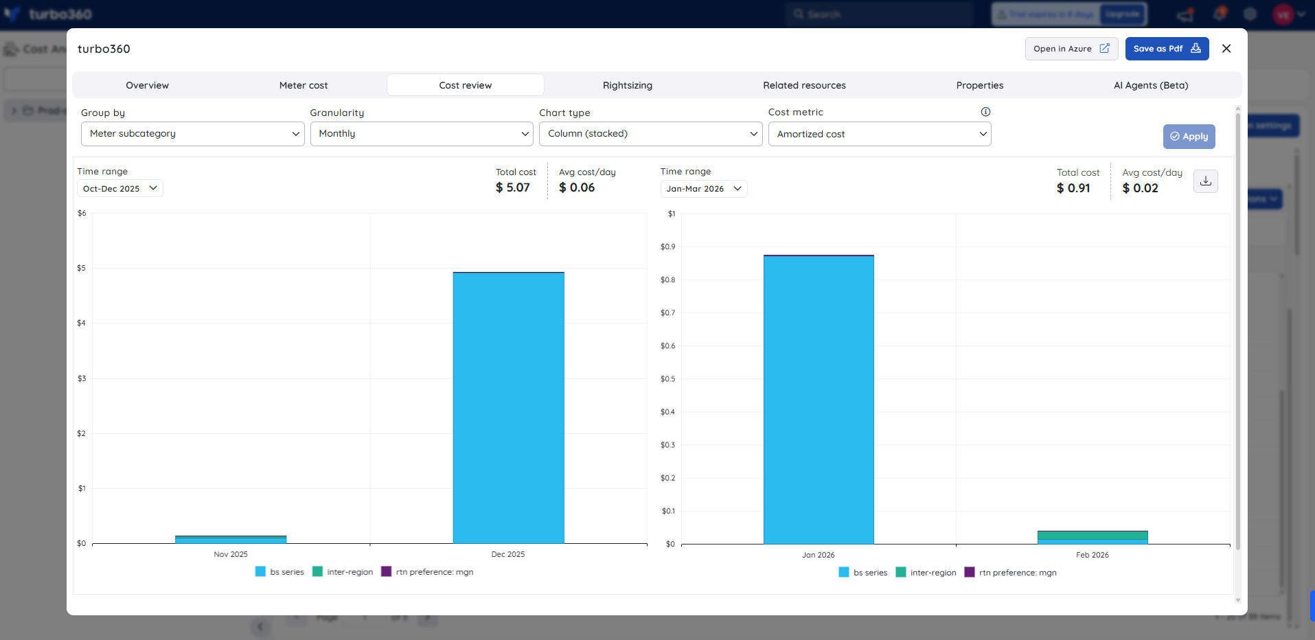
Cost review — interactive charting tools for examining cost trends across time frames, to detect inefficiencies and optimize cloud expenditure.
Rightsizing — visual insights into resource utilization, showing the current and recommended SKU, with the option to apply the recommended SKU instantly.
.png)
Reservation — visualizes resource usage and shows the current and recommended SKU, including available one-year and three-year reservation commitments.
.png)
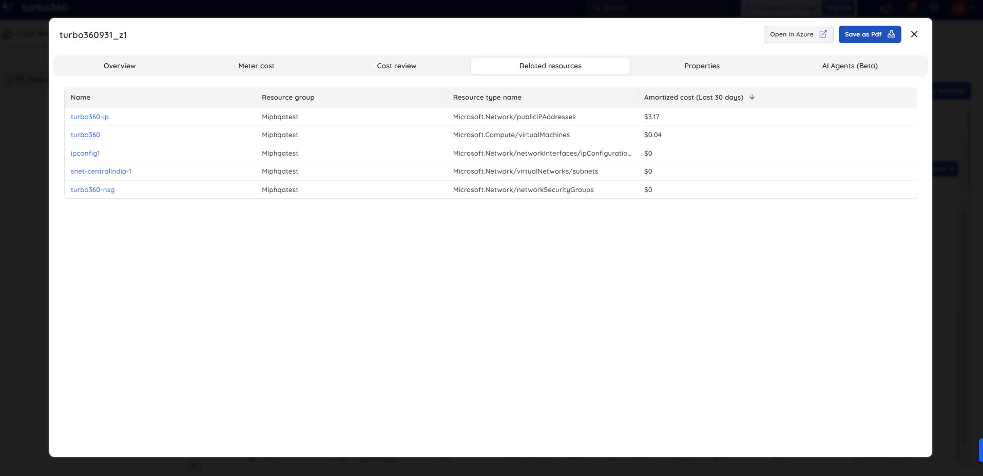
Related resources — lists resources linked to the selected Azure resource, with their amortized costs for the past 30 days.
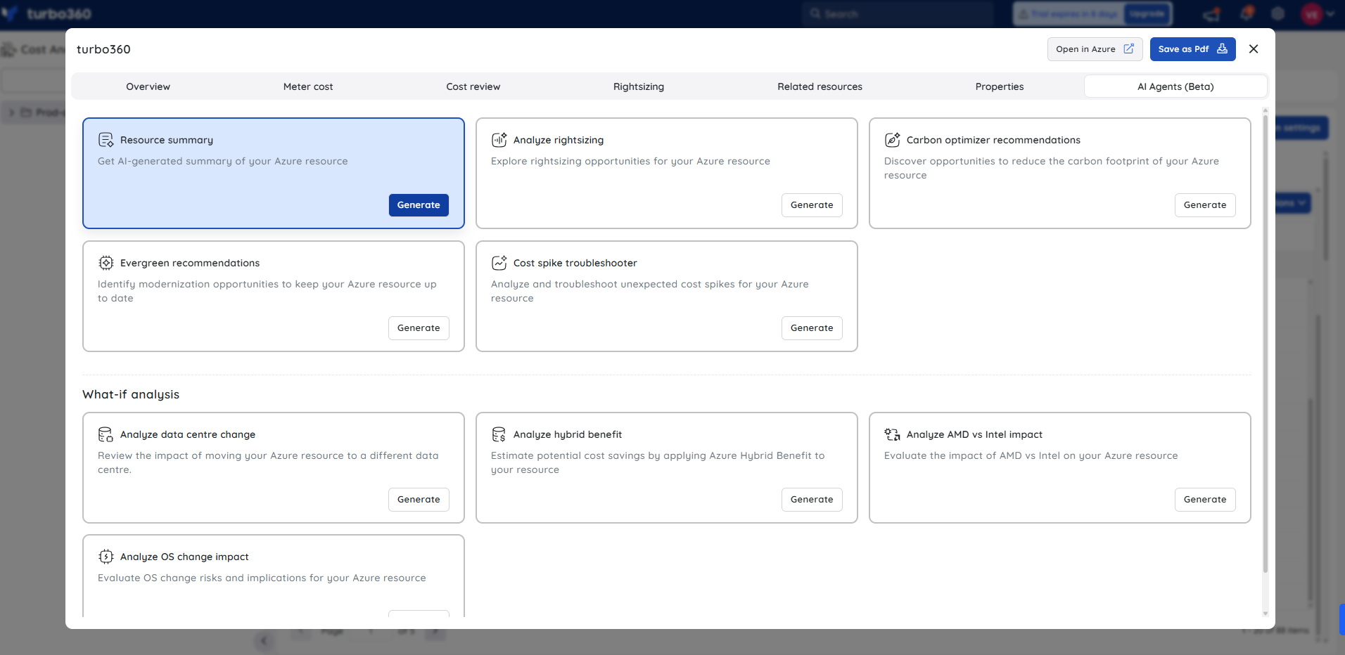
AI Agents — runs automated assessments of the resource and delivers recommendations. The available agents are:
- Resource summary — generates an AI-generated summary of the resource's usage, cost, and health.
- Analyze cost drivers — breaks down meters and cost drivers behind a rise or fall in spend.
- Cost spike troubleshooter — analyzes anomalies, trends, and root cause behind unexpected cost spikes.
- Cost optimization checklist — runs a prioritized, scored audit of cost issues and quick wins.
- Analyze rightsizing — explores SKU, utilization, and savings opportunities for rightsizing.
- Analyze resource purpose — explains the resource's purpose, dependencies, and usage.
- Evergreen recommendations — identifies modernization opportunities and risk to keep the resource up to date.
- Carbon optimizer recommendations — surfaces CO2, region, and energy opportunities to reduce the resource's carbon footprint.
What-if analysis agents model the impact of a hypothetical change before you make it:
- Analyze data centre change — reviews region, migration, and latency impact of moving the resource to a different data center.
- Analyze hybrid benefit — estimates license savings from applying Azure Hybrid benefit.
- Analyze AMD vs Intel impact — evaluates the CPU, performance, and pricing impact of processor choice (AMD vs Intel).
- Analyze OS change impact — evaluates the OS, downtime, and license risk of an OS change.
- Analyze Spot instance impact — analyzes the eviction and savings impact of using Spot instances.
- Analyze resource scheduling — evaluates start/stop or scale-down scheduling and estimates off-peak savings.
Configuration
| Option | Description | Allowed values |
|---|---|---|
| Subscriptions | Selects the subscriptions to include in the view, drawn from the associated Service principals. | Any accessible subscription |
| Time interval | Sets the period for which cost data is displayed. | Preset ranges or a custom range (max 1 year from the current date) |
| Granularity | Controls how cost data is aggregated across the time interval. | Accumulated, Daily, Monthly, None |
| Currency | Sets the currency used to display cost figures. | USD, or the subscriptions' shared primary currency |
| Group by | Groups chart data by a single dimension. | Location, Resource, Resource Group, Resource Type, Subscription, Tag, Service Name, Meter, Meter subcategory, Service family, Product name, Pricing model, Charge type, Reservation, Benefit, Publisher name, Publisher type |
| Chart format | Sets the visualization type for the view. | Area, Column (stacked), Column (grouped),Bar(stacked), Bar(grouped), Line, Table |
| Metric | Switches the cost basis used for visualization. | Actual cost, Amortized cost |
| Include columns | Adds applied filter types as extra columns when Chart format is Table. | Any filter already applied to the view |
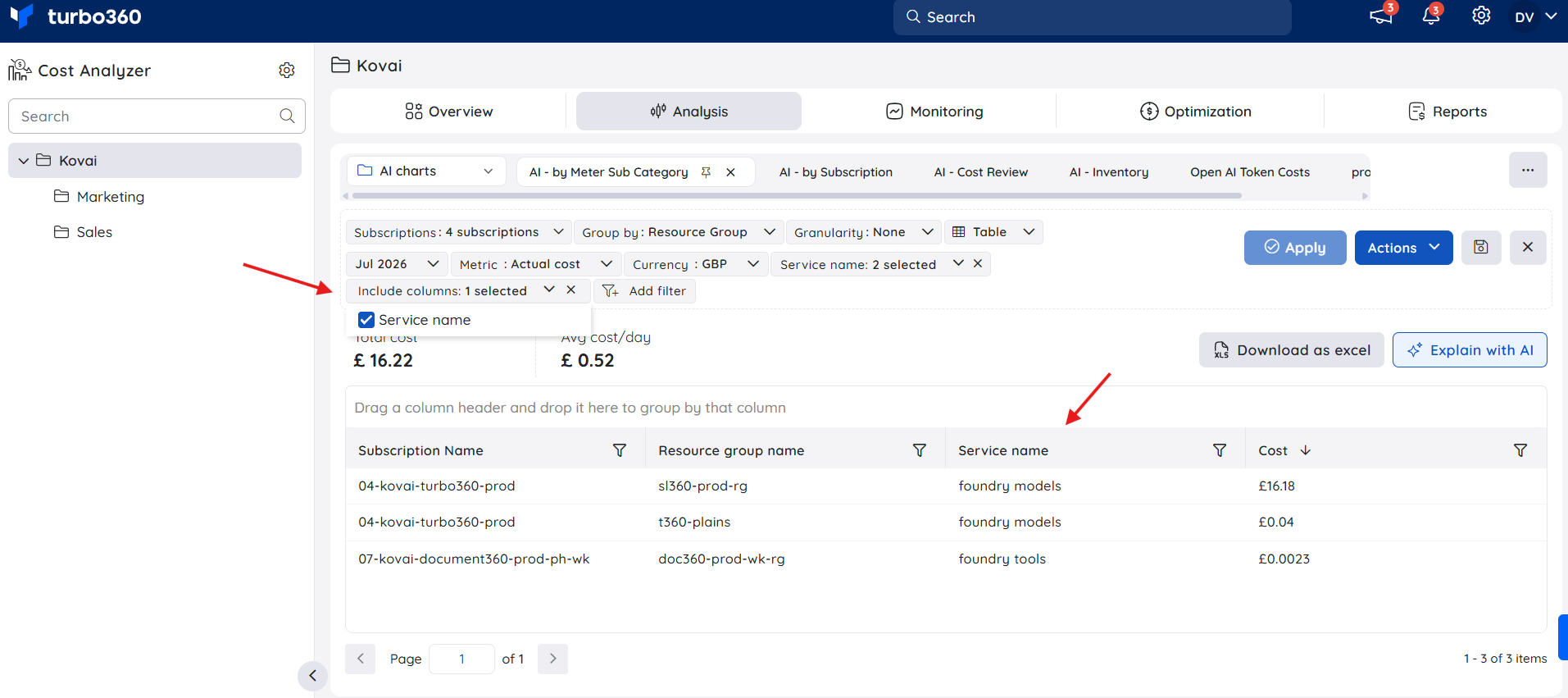
Configuring a table view with Include columns:
- Set the chart format to Table.
- Group the view by a selected filter type.
- Add one or more filter types to the same view.
- Open the Included columns dropdown from the configuration section.
- Select a filter type to include it as an extra column.
The table then updates to show the grouped-by column plus the selected Included columns filter.
Example scenario
A FinOps lead wants to compare last quarter's Azure spend across resource groups to identify which teams are driving the largest costs. They set Time interval to This Quarter, Group by to Resource Group, and the chart format to Column (stacked). They then click into the highest-cost resource group's data point to drill into resource-level costs, and open the Cost intelligence view for the top resource to check its rightsizing and reservation recommendations.
Limitations
- The custom time interval is capped at 1 year from the current date.
- The Area chart format isn't available when Granularity is set to None.
- Forecasting only works for time ranges that include the current date or future dates, and excludes upcoming purchases.
- When subscriptions use different currencies, the Currency filter is limited to USD.
Troubleshooting
- Explain with AI button is not visible on the chart
Cause: The user's Custom role does not have the AI Agents feature permission enabled, or the Analysis feature is not toggled on for the role.
Fix: Go to User management > Roles, edit the relevant Custom role, and enable the AI Agents toggle and the Analysis permission under Specify feature permissions. - The AI Insights panel loads but shows no data
Cause: The selected chart view may have no cost data for the chosen subscription and date range.
Fix: Ensure the subscription has billing data for the selected period and that the chart is configured with at least one grouping dimension before triggering Explain with AI. - Save as PDF produces an incomplete or blank export
Cause: The AI Insights panel may not have fully loaded all sections before the export was triggered.
Fix: Wait for all insight sections to finish loading in the panel, then use Save as PDF again.
FAQs
Why is the Cost intelligence view not showing for my resource?
The Cost intelligence view only becomes available when Group by is set to Resource and Chart format is set to Table. Click a resource from the grid to open it.Why does my saved view show outdated cost data?
Cost Analyzer caches view data and only resets it automatically once a day when the date rolls over. If you've made major changes to the underlying cost group or notice inconsistent figures, manually reset the cache via Actions > Reset cached data.Why can't I see the Area chart option?
The Area chart format isn't available when Granularity is set to None. Choose Accumulated, Daily, or Monthly granularity to enable it.Why is my forecast not showing on the chart?
Forecasting only works for time ranges that include the current date or a future date, with Granularity set to anything other than None and a chart format other than Table.Which chart types support Explain with AI?
All chart types in Analysis support Explain with AI, including area, bar, and line charts as well as charts with grouping dimensions, filters, and date range selections applied.Is the exported PDF the same as what is shown in the panel?
Yes. The PDF reproduces all six insight sections along with the chart metadata — total cost, avg cost/day, date range, metric, and currency — as displayed in the panel at the time of export.
Related articles
Was this article helpful?